We talk a lot about charts and diagrams. Which is hardly surprising, given that Cacoo is built especially for them. But we have an obsession for a reason: when you need to understand something fast, there’s really nothing better.
Thanks to carefully placed lines, colors, or shapes, you can turn boring numbers into something that looks great and makes sense. But this only works under two conditions. Firstly, you choose the right chart for the job. And secondly, that you make it neat. And we’re here to help you do both!
Charts vs graphs: What’s the difference?
Charts and graphs both help us understand data, but they do it in slightly different ways.
A chart is just any way to show data visually, like a diagram or picture. It uses shapes and colors to put info together so you can see patterns fast (your brain processes images 60,000 times faster than words).
Graphs, on the other hand, are mostly about numbers. They show how one thing affects another, like how temperature changes over time or how sales go up and down. Graphs use lines, bars, or dots to represent this kind of relationship.
Here’s where it gets interesting: All graphs are charts, but not all charts are graphs.
A chart can show how data connects, or it can show it in other ways, like a pie chart or table. The main thing is that graphs really get into the numbers and show how things change together, while charts just put data in order. The data doesn’t have to be connected.
Now that’s cleared that up, let’s look at all the different types of charts and graphs you might need in the workplace.
1. Line chart and line graph
A line chart and a line graph are the same. They use a line to connect the dots. It’s great for showing things changing over time. For example, how things change over time or move in a specific direction.
The horizontal line (X-axis) is usually about time. The vertical line (Y-axis) shows you the data you’re tracking, like temperature or how long you spend on your phone.

When to use: It’s perfect for when you want to track things over time or see how something develops, like a product’s performance.
Design tips:
- Keep the line simple and clean.
- Label the axes clearly so people can grasp what the data represents.
- If you have multiple lines, use different colors or markers to help distinguish them.
- Don’t clutter the graph with too many points. Focus on the key trends.
2. Bar chart and bar graph
A bar chart is the same thing as a bar graph. They both use colored blocks to compare data. The length of the bar shows how many units that specific thing is worth. You can put bars horizontally or vertically, depending on how you want to show the data.

When to use: Bar graphs work well when you need to compare different groups, like customer numbers, or website visits.
Design tips:
- Keep bars evenly spaced and the same width for clarity.
- Arrange bars in a logical order, such as from highest to lowest.
- Use consistent colors to avoid confusion, unless highlighting a specific category.
- Label each bar clearly, and include a legend if needed.
3. Column chart or graph
A column chart is essentially a bar chart (or graph) tipped on its side. The bars run horizontally rather than vertically, but they still compare different categories or track changes over time. The height of each column represents the value of that category.

When to use: Use it when you need to compare a handful of categories side by side. It’s also useful for showing trends over time with a small number of data points.
Design tips:
- Keep column width consistent and use spacing so it’s easy to read.
- Use a clear, complementary color scheme.
- Order the columns logically, e.g. by size or time sequence.
- If you’re comparing multiple series, use a legend and distinct colors.
4. Area chart or graph
An area chart is essentially an upgraded line chart, where the space under the line is filled with color. It shows trends over time while also emphasizing data volume. It’s useful when comparing multiple datasets or when showing part-to-whole relationships.

When to use: When you want to show trends over time while also highlighting the overall size of the values. It’s great for visualizing things like total sales over months or website visits across different sources.
Design tips:
- Use transparency if stacking multiple areas to keep data visible.
- Avoid using too many overlapping areas to prevent clutter.
- Use smooth lines to improve readability unless precise points are needed.
- Keep colors muted so they don’t overpower the data.
5. Stacked bar chart
A stacked bar chart is like an evolved version of the OG. Here, bars are split into segments that show different parts of a whole. Each section of the bar represents a category, which makes it easy to compare both total values and individual components.
When to use: When you want to compare overall category sizes while also breaking them down into subcategories. It’s useful for things like sales by product category across different regions or expenses broken down by department.
Design tips:
- Choose contrasting colors for different segments to improve readability.
- Keep the number of stacked categories reasonable to avoid clutter.
- Label segments clearly or use a legend for easy reference.
- Use a 100% stacked bar chart when comparing proportional differences rather than absolute values.
6. Mekko chart
A Mekko chart (also called a Marimekko chart) is a mix of a stacked bar chart and a 100% stacked bar chart with different column widths. It shows proportions and absolute values in one view.
When to use it: It’s good when you’re comparing things and their relative importance. Try it for market share, money comparisons, and business plans.
Design tips:
- Keep the number of categories manageable to avoid visual clutter.
- Use a clear color scheme to differentiate segments.
- Label percentages or values inside the segments when possible.
- Make sure the width of columns is proportional to the data it represents.
7. Dual-axis chart
A dual-axis chart (or combination chart) lets you plot two different datasets on the same graph. It does this via two vertical axes (one on the left and one on the right).
When to use: Use it when you need to compare two related trends that have different units, like revenue (dollars) and units sold (sandwiches).
Design tips:
- Use contrasting colors or different line styles for each dataset.
- Make sure both axes start at a logical baseline to avoid misleading visuals.
- Avoid using more than two datasets, as it can make the chart hard to read.
- Label both axes clearly to prevent confusion.
8. Scatter chart
A scatter chart (or scatter plot) uses dots to show relationships between two variables. It’s good for spotting patterns and outliers in big datasets.

When to use: When you want to see if two things are related, like hours studied vs. exam scores or advertising spend vs. sales. It helps you spot trends and unexpected data points.
Design tips:
- Keep dots small and semi-transparent if there are lots of data points.
- Label axes clearly with units and meaningful titles.
- Add a trendline if needed to show the overall direction.
- Avoid overloading with too many variables — keep it simple!
9. Pie chart (or circle diagram)
A pie chart is a circle split into slices. Each slice represents a proportion of a whole, expressed as a percentage.

When to use: Use it when you need to show how different parts contribute to a whole, like budget breakdowns or market share. But bear in mind it works best when there are only a few categories — too many slices and things get hard to read.
Design tips:
- Limit the number of slices to 5 or fewer for clarity.
- Use distinct colors for each slice to improve readability.
- Label slices directly with percentages to avoid needing a separate legend.
- Avoid 3D effects, as they can distort the data.
10. Tree diagram
A tree diagram (or tree chart) shows hierarchical relationships using branching lines. It starts with a main category then splits into subcategories (the tree’s branches or roots, depending on which way up it runs), making it great for visualizing structures and decision-making processes.

When to use: Use a tree diagram to show (not literal) parent-child relationships, like company structures, website navigation, or decision processes. It’s also handy for breaking topics down into smaller parts.
Design tips:
- Keep labels clear and to-the-point.
- Arrange branches logically to avoid a messy layout.
- Use color coding to highlight different levels or categories.
- Make sure branches are evenly spaced for readability.
11. Histogram
A histogram looks like a bar chart, but instead of showing individual categories, it groups numbers into ranges (called bins) and shows how many fit in each group.
When to use: It’s good when you’re analyzing how often values show up in a dataset, like test scores or customer ages. It also helps spot patterns like skewed distributions or outliers.
Design tips:
- Choose appropriate bin sizes to reveal patterns without oversimplifying.
- Avoid gaps between bars since histograms represent continuous data.
- Label axes clearly to show value ranges.
- Use a neutral color to focus attention on the shape of the distribution.
12. Density curve
A density curve is a line that shows how data is spread out over a range of values. It’s like a histogram but uses a line instead of bars.
When to use: Use this to show the shape of data, like population or scores. It’s good for comparing multiple distributions.
Design tips:
- Use shading or transparency to distinguish overlapping curves.
- Label key peaks or dips to highlight important trends.
- Keep the curve smooth but accurate to reflect the true distribution.
- Make sure the scale of the x-axis is appropriate for the dataset.
13. Box plot
A box plot (or box-and-whisker plot) is a way to show the distribution of data. It shows the minimum, first quartile, median, third quartile, and maximum values in a dataset. The “whiskers” show how much the numbers change outside the upper and lower quartiles. The box represents the interquartile range (IQR), and the line inside the box shows the median.
When to use it:
Use this graph when you want to see how spread out or skewed a set of numbers is, compare different sets, or find outliers.
Design tips:
- Label the quartiles and median clearly.
- Don’t put too many things on the graph. A few sets of data are better.
- Use the same scale to compare different box plots.
- Think about using colors or shading to point out the odd numbers or certain ranges.
14. Violin plot
A violin plot is like a mix between a box plot and a density curve. It shows how data is distributed AND concentrated. The wider the shape, the more data points are in that range.
When to use: Use it when you want to compare multiple distributions, especially when you want to see the shape of the data beyond just averages. It’s great for visualizing things like salary across different job roles or test scores across schools.
Design tips:
- Keep the number of groups manageable to avoid a cluttered chart.
- Use symmetrical designs for easy comparison.
- Add markers for median or quartile values to give more context.
- Ensure the x-axis labels are clear and readable.
15. Heat map
A firm favorite in the UX world, a heat map represents data using color, with different shades indicating varying values.
When to use: Use a heat map when you need to show patterns or intensity levels across a dataset. It’s useful for things like showing peak hours of website traffic, which is why product designers love them.
Design tips:
- Use a color gradient that makes the differences clear (e.g., light to dark).
- Avoid too many colors to avoid confusion — stick to 2-3 shades.
- Add a legend to explain what the colors mean.
- Ensure text labels don’t get lost in the background color.
16. Bullet chart
A bullet graph is a compact way to show progress toward a goal. It looks like a horizontal bar with markers showing targets or performance levels. You’ll often see it in dashboards and reports.
When to use: Use it when you want to track performance against a goal, like sales targets or project progress.
Design tips:
- Keep the design simple and uncluttered for easy reading.
- Use contrasting colors to highlight target lines and actual performance.
- Limit the number of benchmarks to avoid overwhelming the viewer.
- Place labels directly on the graph for clarity.
17. Pareto chart
The Pareto principle (80/20 rule) is the idea that a small number of things account for most of the effects. A Pareto chart, like its namesake, uses bars and lines to show what factors have the biggest impact. combines a bar chart and a line chart to show which factors have the biggest impact. The bars represent categories, while the line shows the cumulative percentage.
When to use it: It’s a good option when you need to find the main problems in a dataset. For example, why do customers complain?
When to use: It’s a good option when you need to find the main problems or causes in a dataset. For example, why customers complain or which products sell best.
Design tips:
- Arrange bars in descending order for quick insights.
- Use a secondary y-axis for the cumulative percentage line.
- Label key data points to highlight major contributors.
- Avoid using too many categories — group smaller ones into an “Other” category.
18. Gantt chart
A Gantt chart is a timeline-based bar chart that helps you plan and track project tasks. Each bar represents a task, showing when it starts and ends and how it overlaps with other tasks.

When to use: Use it when managing projects with multiple tasks and deadlines, like software development or event planning.
Design tips:
- Keep task names short and clear.
- Use color coding for different teams or task types.
- Show dependencies with connecting lines to highlight relationships.
- Keep the timeline scale appropriate — daily, weekly, or monthly — depending on project length.
19. Geo chart
A geo chart (or geographic map) shows data on a map, with colors, bubbles, or shading used to represent values. You’ll often see it when looking at regional trends like sales or population density. I
When to use: Use a geo chart when your data is location-based, like website traffic by country, customer distribution by city, or election results by state.
Design tips:
- Choose a clear color scale to avoid misinterpretation.
- Use tooltips to show exact values when hovering over a region.
- Keep labels readable without cluttering the map.
- Use a projection that accurately represents the data (avoid distorted maps).
20. Waterfall chart
A waterfall chart is a type of bar chart that shows how an initial value goes up or down before reaching a final value.
When to use: Use a waterfall chart when you want to show how different things add up to a total, like cost breakdowns in a project.
Design tips:
- Use different colors to distinguish positive and negative changes.
- Include starting and ending values for clarity.
- Label each bar with exact amounts to avoid confusion.
- Keep the number of steps manageable for readability.
21. Donut chart
A donut chart is a variation of a pie chart with a hole in the middle. It represents parts of a whole but leaves space for extra information, like total values or category labels.
When to use: Use it when you want to show proportions, like a pie chart, but also want to show an overall total, or compare several datasets side by side.
Design tips:
- Limit the number of slices to keep it easy to read.
- Use the center space for a total value or key insight.
- Choose distinct colors for each slice.
- Avoid 3D effects that can distort perception.
22. Funnel chart
A funnel chart shows data flowing through steps, narrowing down at each stage. You’ll often see these in sales, where they show conversion rates (how many website visitors turn into customers).

When to use: Use it when showing a step-by-step process with drop-offs at each stage.
Design tips:
- Arrange stages from widest to narrowest for clarity.
- Use consistent spacing between levels.
- Label percentages or values to show drop-offs clearly.
- Keep the number of stages reasonable to avoid overcomplication.
23. Bubble chart
A bubble chart is a type of scatter plot where data points are represented as circles (bubbles). The size of each bubble represents a third variable, adding another layer of information. It’s useful for comparing multiple factors at once.

When to use: Use a bubble chart when you need to show relationships between three variables, e.g. revenue, market share, and customer base size. You’ll often spot these in business analytics and market research contexts. research.
Design tips:
- Use clear labels or tooltips to explain what each bubble represents.
- Avoid overlapping bubbles to prevent clutter.
- Use a consistent color scheme to group related data points.
- Make sure the bubble size scale is meaningful and not misleading.
24. Candlestick chart
A candlestick chart is a financial chart that shows price movements over time. Each “candlestick” represents four key prices: opening, closing, high, and low. It’s a classic stock market tool.
When to use: Use it to track asset prices over time, like stocks or cryptocurrencies. It helps traders spot trends and market patterns.
Design tips:
- Use established color coding (e.g., green for price increases, red for decreases).
- Keep the time intervals consistent for accurate trend analysis.
- Include grid lines or reference points for easier reading.
- Avoid unnecessary elements that could clutter the chart.
25. KPI (Key Performance Indicator) chart
A KPI chart is a simple visual representation of a key metric, like sales revenue, customer churn, or conversion rates. It often includes lots of supporting visual elements like trend arrows, progress bars or gauges.
When to use: Use a KPI chart when you need to highlight a single, important metric in dashboards or reports. It’s great for tracking business performance at a glance.
Design tips:
- Keep it minimal — focus on the most important number.
- Use color coding (e.g., green for positive trends, red for negative).
- Include a comparison (e.g., percentage change from last month).
- Ensure numbers are easy to read, even at a quick glance.
26. Sankey chart
A Sankey chart is a type of flow diagram. It shows how quantities move between different categories, with the width of each flow representing the volume being transferred. You’ll often see it used for energy usage or budget allocation.
When to use: Use a Sankey chart when you need to visualize flow and distribution, like how users navigate a website or how resources are allocated.
Design tips:
- Use smooth, curved flows to make the chart visually appealing.
- Keep categories and labels clear to avoid confusion.
- Use distinct colors for different flows to make them easy to track.
- Don’t overload the chart with too many categories — group smaller ones if needed.
27. Radar chart
A radar chart (or spider chart) shows multiple variables in a circular layout. It’s useful for comparing multiple factors side by side.
When to use: Use a radar chart when comparing different categories across multiple dimensions, like team performance, or survey responses.

Design tips:
- Limit the number of variables to avoid clutter.
- Use different colors for each dataset to improve readability.
- Ensure each axis is equally spaced for fair comparisons.
- Avoid using if precise comparisons are needed — bar charts may work better.
How to choose the right chart or graph for your data
You need to know what you want to show. Here are some questions to guide you:
- Do I want to show a trend over time?
- Line chart
- Area chart
- Stacked area chart
- Do I want to compare categories or groups?
- Bar chart
- Column chart
- Pie chart
- Donut chart
- Stacked bar chart
- Do I want to show the relationship between two variables?
- Scatter plot
- Bubble chart
- Dual-axis chart
- Do I want to show the distribution of a variable?
- Histogram
- Box plot
- Violin plot
- Density curve
- Do I want to highlight parts of a whole?
- Pie chart
- Donut chart
- Stacked bar chart
- Do I want to show how quantities move or flow between categories?
- Sankey chart
- Flow diagram
- Do I want to track performance against a target or benchmark?
- KPI chart
- Bullet graph
- Do I want to show complex relationships or large datasets?
- Heat map
- Radar chart
- Scatter plot
- Mekko chart
Get started with diagramming tools
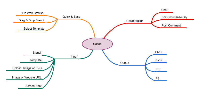
Using diagramming tools for charts and graphs can make data easier to understand, which means better decisions and teamwork. Instead of getting bogged down in complicated data, good visuals help you share what you’ve learned fast. Whether you’re keeping an eye on marketing trends, looking at different sets of data, or planning project timings, a solid diagramming tool can save you time and clear up confusion.
Cacoo lets you build, share, and work together on charts with zero fuss. Just choose your template, add your data, and then share it on the cloud for your team to access, no matter where they are. Whether you’re running a small startup or a multinational business, Cacoo makes it easy. Ready to make your data pop? Try it for free today!
About Author

Georgina Guthrie
Guest authorGeorgina is a displaced Brit currently working in France as a freelance copywriter. Before moving to sunnier climates, she worked as a B2B agency writer in Bristol, England, which is also where she was born. In her spare time, she enjoys old films and cooking (badly).