Ever run a brainstorming session, only to feel a bit overwhelmed when faced with dozens and dozens of ideas post-event? An affinity map (aka an ‘affinity diagram’) is the answer to that problem.
Think of affinity mapping as a giant organizer. Instead of letting all those ideas float around in random places, you sort them into groups that naturally connect. It’s like untangling a big knot of thoughts until patterns start to show up.
Affinity mapping isn’t just for designers or researchers — it works for almost anything. Trying to spot trends in customer feedback? Affinity map it. Sorting through project tasks with your team? An affinity map can help. Even deciding on vacation plans with friends can get way easier when you see everything laid out and grouped together.
So, if you’ve ever looked at a messy pile of ideas and thought, “Where do I even start?” — don’t worry. Affinity mapping is about to be your new go-to trick for bringing order to the madness.
What is affinity mapping?
An affinity map is a tool for organizing information into logical groups for analysis. This means that rather than ending up with heaps of disparate information, you have digestible chunks of similar ideas.
Affinity: NOUN. A liking or sympathy for someone or something, especially because of shared characteristics.
It’s especially useful when you’re grappling with a complex issue or juggling large amounts of data/ideas that are difficult to align.
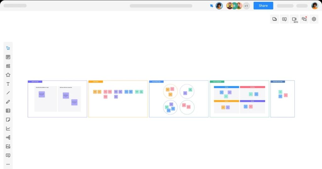
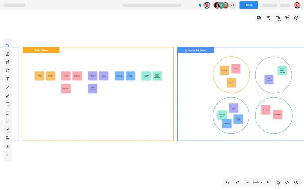 An affinity map diagram created in Cacoo
Quick heads-up: affinity mapping is not the same as card sorting. Card sorting is a user research method to test how people categorize information (like menu structures or nav labels). Affinity mapping is more about making sense of your ideas or data — especially messy, qualitative stuff — by grouping similar things together. Different goals, different tools.
Where did affinity mapping come from?
The affinity map was invented by Japanese anthropologist Jiro Kawakita, and is a part of the Seven Management and Planning Tools set — a series of methods designed to promote productivity, communication, and better planning within an organization.
- Affinity map or affinity diagram (aka ‘the KJ method’ after its creator)
- Interrelationship diagram
- Tree diagram
- Matrix diagram
- Prioritization matrices
- The Process Decision Program Chart (PDPC)
- The Activity Network Diagram
What are the benefits of affinity mapping?
Affinity mapping makes it easy to gather and organize large sets of data. It’s the perfect partner to a brainstorming session because it gives you a solid structure for turning ideas (generated during brainstorming) into actionable tasks.
It’s also a handy tool for design teams: seeing the data brought to life in groups and themes, with connections highlighted and themes prioritized, helps members immerse themselves in the job and see how their work fits into the bigger picture.
An affinity map example
Let’s say you’re part of a product team brainstorming ways to improve the user onboarding experience for a mobile app. After a speedy idea-generating session, you’re left with a chaotic list of sticky notes like:
- “More tooltips”
- “Shorter signup form”
- “Intro video”
- “Gamify onboarding”
- “Live chat support”
- “Clearer error messages”
- “Progress tracker”
Using an affinity map, you’d start grouping these ideas into themes — maybe something like:
- Guidance and support (tooltips, live chat, error messages)
- Streamlined experience (shorter form, progress tracker)
- Engagement techniques (gamification, intro video)
From there, you’d assess which groups align best with your goal (in this case, reducing user drop-off), prioritize them, and begin translating those themes into clear action points – or rename them based on common UX categories: Navigation issues, Support gaps, Delight features, Trust builders.
Clear, punchy cluster names clarify your team’s thinking and speed up decision-making. It’s a simple way to bring order to creative chaos, and helps teams make the leap from “we’ve got ideas” to “here’s what we’re going to do.”
When should you use affinity mapping? And when shouldn’t you?
Affinity mapping is a great choice when you’ve got lots of ideas or qualitative data and you need to make sense of the mess. It shines in situations where you’re:
- Kicking off a new project and need to explore potential directions
- Reviewing user research, feedback, or survey results
- Trying to solve a complex problem with lots of moving parts
- Brainstorming with a large team across different departments
- Looking to identify gaps or themes in open-ended input.
That said, affinity mapping isn’t a magic wand for every project. If your dataset is small or you’re chasing quick, numbers-based metrics, you’ll get further with other tools — a prioritization matrix, a customer journey map, or even a humble spreadsheet.
Think of it this way: reach for an affinity map when you need to step back and see patterns you didn’t know were there. Skip it when the patterns are already obvious.
How UX teams can use affinity mapping
For UX teams, an affinity map isn’t just for when you run out of Post-its — it’s a thinking tool. It forces you to step back, sift through the chaos, and see what’s really there.
Maybe you’re wrapping up a design sprint, or maybe you’ve just staggered out of a week of user interviews with pages of transcripts, half-legible notes, and quotes you can’t decipher. You start pinning them up, grouping the scraps that seem to belong together — pain points, needs — A pattern starts to take shape: navigation complaints cropping up in half your interviews, or a low-level grumble about loading times that’s somehow become a roar.
These clusters give you the lay of the land before you decide where to dig.
Affinity mapping helps different disciplines collaborate
They also get your whole team speaking the same language. When you’re mapping ideas in real time, you create space for different perspectives to emerge, mix, and merge — which is exactly what you want. An engineer might group things one way, a researcher another. That tension? It’s productive.
And because an affinity map is so visual, you can point to it in a meeting and make your case without a 40-slide deck. The patterns are right there, in plain view — hard to ignore, let alone argue with. For this reason, it’s also an ideal tool for stakeholder engagement.
Affinity mapping slots neatly into lots of UX workflows. Use it after a round of user interviews, during a design sprint, or when you’re building out a product vision. It’s just as handy for big-picture strategy as it is for feature prioritization or journey mapping.
The first step: planning your affinity map
Creating an affinity map is easy. But before you launch into it, there are three things you need to do to make sure you get the best results.
1. Choose your team carefully
Teamwork is best when you have multiple viewpoints and personalities all working together to tackle the problem. Not only does this mean you’ll get a more diverse set of solutions — you’ll also find different members of the team complementing each other’s working styles.
For example, someone might be wonderfully creative but not so good at organization, another person might be quiet, but brilliant at playing devil’s advocate. Someone else might be a natural leader. These are all important perspectives and approaches.
It’s also a good idea to bring in people from different departments and levels of the organization. This gives a rounded approach to the problem and how certain solutions affect different levels of the business.
Top tip: To get everyone collaborating cohesively, understand what you’re up against before you begin. There are multiple potential barriers to communication — including language, gender, and cultural differences — not to mention distance. Get to know how to overcome these issues to get the most out of your team.
2. Assign a leader
Running any kind of ideas meeting without a leader is a bit like having an orchestra without a conductor. You need someone to lead the way or it could end up turning into a bit of a free-for-all.
A good leader is someone who can help get the most out of other participants by encouraging each person and making sure a couple of the louder ones don’t dominate the discussion. They should also be good at analyzing information and turning insights into actionable tasks.
3. Run a brainstorming session
Without a brainstorm, there’s no affinity map. During the session, collect as many ideas as you can — something you can do virtually or via a whiteboard and sticky notes. Don’t try and sort them now.
Top tip: If you’re running a virtual brainstorming session, use a cloud-based tool, like Google Docs or an online diagramming tool so everyone can log in and add ideas at the same time.
Stage 2: Making your affinity map diagram
So far, you’ve been in divergent mode — letting every idea out, no matter how rough. Now it’s time to switch gears. The next stage is all about converging: spotting patterns, making sense of the noise, and shaping something useful out of the chaos. This is where your affinity map begins to take shape.
1. Create your first group
Once you’ve collected all your ideas in one place, it’s time to start sorting them into common themes.
Select your first idea and decide on a group/category together. For example, if you ran a restaurant and were brainstorming dish ideas, lobster chowder might go under ‘appetizers,’ or the even more specific ‘seafood appetizers.’
2. Define the remaining groups
Next, pick another idea and ask the team whether it belongs in the same group as the first one. If yes, you know where to put it. If not, create a new group for that idea. Keep doing this with each subsequent idea until they’re all sorted into groups.
This might take a few attempts. You may find you have too many groups and need to refine further. Generally speaking, anything from 3-10 is ideal — go above this and you lose the clarity this method seeks to bring. Or you might discover different team members disagree about which group an idea belongs in. In this case, a vote could help the team reach a decision.
3. Assess your groups
Once you’ve got all your groups set out, you might notice hierarchies or links emerge. Feel free to note these down (color-coordinating works well here). Don’t worry if this doesn’t happen — it’s perfectly fine to have multiple unrelated themes.
4. Prioritize your groups
Organize your themes according to how well they’ll help you accomplish your primary goal. While doing this, consider both ease and budget: Some might be quick wins (cheap, quick, and easy to do). Others might be more expensive/time-consuming but have a big impact.
If your team can’t agree on what to tackle first, try dot voting: everyone gets a set number of dots (or digital votes) to place on the themes they think matter most. When the dust settles, assign a point person to take each top theme forward — otherwise you risk losing momentum.
Top tip: Try matrix organization as a method for helping you prioritize your themes and tasks.
5. Turn your themes into actions
Once you’ve prioritized your list of themes, you’ll need to turn them into actionable tasks. Project management software is a good option here: Simply add your list of tasks into the software along with the diagram, then start assigning jobs and setting deadlines.
And don’t forget to document your map — whether it’s a digital board or a photo of your wall of Post-its. You’ll want to refer back to it later, especially when you’re presenting your findings or explaining why certain priorities made the cut.
Having a clear schedule in place will help you and the team make sure those high-priority jobs are tackled in a timely manner.
Quick tips for better affinity diagramming
Here are some pointers for getting the most out of this handy system.
- Keep ideas short and punchy. If you add too much detail at this stage you’ll slow things down (not to mention have an overly complicated-looking diagram).
- Look for priorities. What may be a priority for you might not be a priority for the overall business — keep this in mind when ranking your groups.
- Organize your diagram in a way that works for you. Make use of color and lines, arrows, and shapes, which all make the data easier to understand.
- Be alert to insights, and describe them as you go. Perhaps connections highlight something you’d not noticed before — or maybe you’ve spotted a potential gap or user need you’d overlooked. Take note.
- Use the right tools for the job. Sticky notes are fine, but they get lost, look messy, and are difficult to organize and share. Your best bet is to use a cloud-based tool, like Cacoo. Not only can everyone log in and work on the diagram at once — it’s also neater, easier to share — and more collaborative thanks to real-time commenting and notifications.
Make it stick: why the right diagramming tool matters
Affinity mapping can help you sort through data, draw insights, and gain a greater understanding of the task at hand — whether that’s helping you spot a gap in your project, or alerting you to a user need you’d not considered until now. Best of all, it’s a really simple process to follow, made all the simpler with diagramming software.
With Cacoo, our own tool, you can work in real-time together or remotely, adding ideas, sorting tasks, leaving feedback, and turning all those ideas into something that’s easy to understand and most importantly — actionable. Try it for free today!
This post was originally published on September 26, 2025, and updated most recently on November 11, 2025.
About Author

Georgina Guthrie
Guest authorGeorgina is a displaced Brit currently working in France as a freelance copywriter. Before moving to sunnier climates, she worked as a B2B agency writer in Bristol, England, which is also where she was born. In her spare time, she enjoys old films and cooking (badly).