We’re surrounded by information design every day. From train station maps to infographics, exhibitions to tutorials — it’s all around us. Yet, most of the time, we don’t give it a second thought, nor do we necessarily know how to pin it down. What counts and what doesn’t? And how is it different from other displays of information?
In this article, we’ll take a deep dive into the fascinating world of information design, then share some tips on how to get started on your own creation. Let’s get to it!
What is information design?
Information design is all about presenting information in a way that’s easy to understand. It’s a subsection of graphic design related specifically to displaying information effectively (and stylishly).
It can include facts and figures, stories — even sound and scent — as part of its information-sharing capabilities.
Why is information design important?
Information design makes information interesting, easy to understand, and fun. Unlike data, it draws the viewer in and takes them on a mini-journey. Not only does it help make information easier to digest, but it also makes information more accessible.
- Images or videos instead of words mean non-native speakers, individuals with low or no literacy rates, and those with dyslexia can access valuable information.
- Adding audio or incorporating extra-large fonts into your design can help those with sight problems.
- Turning data into an infographic means information is presented in bite-sized chunks that are easy to understand far quicker than if the reader had to draw conclusions themselves.
What’s the difference between information design and data visualization?
Data and information — two words with similar meanings. According to the OED, information is “The imparting of knowledge in general.” Data, on the other hand, is defined as “facts and statistics collected together for reference or analysis.”
So, data is facts and figures, whereas information can be anything from statistics to a lecture, story, or graph.
Or, in other words: Information gives the viewer a message. Data gives the viewer raw material from which they can draw their own conclusions.
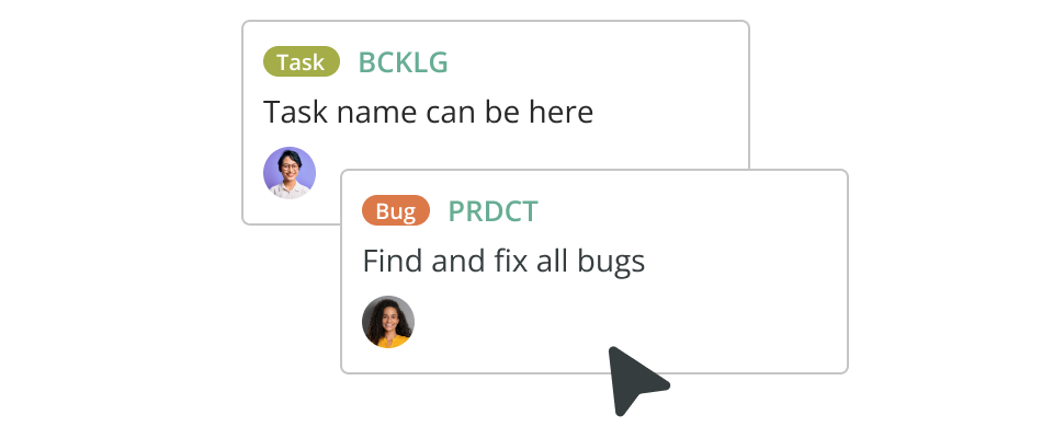
Data visualization could encompass graphs, timetables, and charts that evolve as more information is added. It could be the Kanban board you use to keep jobs on track, a speedometer, or a price list. Information design encompasses graphics such as infographics (which in themselves can include data visualization) and any other tool that leads the viewer toward a bite-sized conclusion.
Types of information design
Information design is all about combining bits of information and data so it makes sense to the reader. It’s an incredibly broad umbrella — let’s take a closer look at some examples.
- Bite-sized information: Infographics, how-to videos, tutorials
- Searchable information: Search engines, product lists, websites
- Educational resources: Museum guides, exhibits, microsites
- Curated information: Exhibits, infographics, look-books
- Wayfinding information: Digital and physical maps, trail information, escape plans
- Health & safety: Safety posters, medical apps, leaflets
- Experiential: Scents used in stores, video window displays, 4D cinema.
As you can see, the range is huge. This is by no means an exhaustive list — but it should illustrate the breadth and variety that an information designer might deal with day-to-day.
How are information design and UX design linked?
User Experience (UX) design is all about designing a process that feels great to use. The information must be clear and presented in a way that leads the user logically from beginning to end without them feeling lost or overwhelmed.
It’s typically associated with web design. A UX designer in this context researches, designs, tests, and validates design choices until they solve a problem in the most user-friendly way possible. Someone in charge of design thinking works in exactly the same way.
How should you do information design? Just follow design thinking
Information design follows the same principles as UX. It’s human-centered design with the needs of the user placed at the center of every decision. This is what’s known as design thinking, a process that helps us extract and apply human-centered techniques to solve problems.

In the case of information design, it’s solving the problem of ‘how do we share this information in a way that’s easy to understand?’ Let’s take a look at a real-world example.
Say your information design project is to create a graphic that focuses on food hygiene safety. Here’s what the five design thinking steps might look like this:
Step 1: Empathize
The designer will visit the kitchen where the food prep will happen. They might chat to the kitchen staff about how they typically work, what problems they’re facing, and what they might need from a poster. If it’s not possible to visit the place in person, the designer might do some research either on their own team or with the help of a UX researcher.
Step 2: Define
Next, the designer defines what’s needed using things they learned while chatting to the kitchen staff. With our food hygiene poster example, requirements might include things like lamination so the poster doesn’t crinkle if it gets moist. It should also probably have images rather than words so international workers can understand the message and extra-large diagrams that employees see from afar.
Step 3: Ideate
Next, the designer (or design team) comes up with ideas that answer the requirements. They’ll also consider things like how best to make sure the poster is clear, attractive, and easy to understand.
Step 4: Prototype
This is the first draft of your design. It’ll be put up in the kitchen as a trial run. The aim of design prototyping is to collect real-world feedback, which is highly important.
Step 5: Test
Is the poster doing its job? There may be metrics to measure here, like a reduction in food poisoning cases, better hygiene scores from local authorities, an increase in hand-washing among staff… and so on.
Or perhaps the posters are working but could be improved. For example, non-gloss lamination so glare doesn’t obscure the images. Maybe better placement around the kitchen. Once feedback has been shared with the designer, they’ll go back to stage one and refine the posters until they’re as close to answering the brief as possible.
The key principles of great information design
Before you jump into your own creation, it helps to know what makes information design actually work. These principles will help you create something that’s clear and genuinely helpful. An information design checklist to have handy at all times.
1. Start with the user
There’s a reason “empathize” is step one in the design process. Great design begins with this VIP. Get clear on who your design is for, how they’ll use it, and how it’ll help them. Ask questions, and try to see the world through their eyes (generative research is a good option here). Designing with your user in mind will shape every decision you make, from language to layout.
3. Structure comes first
What’s the best way to reach a new destination? Via the destination name, or a step-by-step map?
It sounds obvious, but organize your content in a way that flows logically. Think of structure as signposts: headings, sections, layouts, and even reading order all help your audience move smoothly from start to finish. And be sure to do a test run with someone besides the designers, because those designing tend to be too familiar to see whether it’s genuinely intuitive.
4. Keep it clear and simple
Remember KISS (keep It Simple, Stupid!) principles. Use plain language in readable fonts, and choose visuals that support your message (not distract from it). If your audience has to scroll endlessly or re-read, it’s time to go back to the drawing board.
5. Use hierarchy and emphasis
Help your reader know where to look first. Headings, bold text, size, and placement can all guide the eye and highlight what’s important, just like we’ve done in this blog post and in the example below. Just be strategic — emphasis loses its impact when everything is shouting for attention.

6. Make it cohesive
Your fonts, colors, icons, tone, and structure should all feel like they belong together. Consistency builds trust and makes content easier to process.
7. Prioritize accessibility
Use strong contrast for text, legible font sizes, alt text for visuals, and consider users with visual impairments, neurodivergence, or limited literacy. Information design should widen access, not limit it.
9. Turn data into a story
Raw information is just the beginning. The best information design helps users find meaning — whether that’s through a visual metaphor or just smart sequencing of content. Think of your design as a mini narrative that guides the viewer from problem to clarity.
10. Make it beautiful — but functional
Yes, looks matter — to a point. Good information design should invite people in, not overwhelm them. Use white space generously. Stick to a limited, purposeful color palette. Apply Gestalt principles to group related elements and create intuitive flow. And always remember: beauty should serve clarity, not compete with it.
7 information design examples to inspire you
Let’s look at great information design in the real world.
1. Wayfinding

Classic yellow-and-black overhead signage in an airport concourse shows exemplary use of wayfinding design. Bold color contrast, pictograms, and arrows ensure quick, intuitive navigation for travellers .

These stainless‑steel directory and wall signs guide visitors through New York’s Javits Federal Building. The design uses high contrast, clear typography making it both aesthetically cohesive and navigable.
2. Searchable information

Smithsonian Learning Lab is an online platform offering searchable access to thousands of artifacts, allowing educators and students to filter resources for specific topics or themes.
3. Government information design

The procedure for speaking to a member of congress begins with finding your representative via postcode. It also includes a list of clickable links, including a directory and FAQs.
4. How-to guides

This NHS PPE video screenshot illustrates how quick, visual steps — ‘Don apron’, ‘Put on mask’ — can guide users efficiently. Perfect for brief how-to content or safety reminders.
5. Curated information

WebExhibits is a virtual micro‑museum featuring themed sections like “calendar myths” or “color perception.” Infographics, interactive demos, and curated narratives guide users through each topic.
6. Experiential

This display by the Health Foundation combines traditional signage with education and experiential elements — passers by can learn about the building via an illuminated, 3D display.
7. Warning signs

While this sign is written in English, easy-to-understand images transmit the message loud and clear to all.
Now it’s your turn
Without information design, the world would be a more confusing — and less safe — place. Textbooks would be dense walls of text, airport signage would leave travelers guessing, and vital warnings might go unnoticed by those who don’t speak the language.
Good information design doesn’t just make things look better. It helps people understand and navigate with confidence. The best part? You don’t need to be a graphic design pro to start applying these principles. With the right diagramming tools, you can start right away.
Cacoo, our own diagramming software, comes with ready-made templates and easy editing features to help you create everything from wireframes and user story maps to infographics and project plans. Just pick a template, edit it in a few clicks, and share your message with impact. Ready to take it for a spin?
This post was originally published on May 7 2021, and updated most recently on July 3, 2025.
About Author

Georgina Guthrie
Guest authorGeorgina is a displaced Brit currently working in France as a freelance copywriter. Before moving to sunnier climates, she worked as a B2B agency writer in Bristol, England, which is also where she was born. In her spare time, she enjoys old films and cooking (badly).