Wireframes are static diagrams of content, usually comprised of a series of plain boxes that denote how elements are to be arranged on a page. They serve as the “skeleton” of a website. And one of their most important purposes is to communicate content hierarchy.
What are the benefits of wireframing?
So, what exactly is a wireframe, and why do we need one?
Wireframes are low-detail mockups of a website. They often start as basic hand-drawn sketches on paper or a whiteboard. Wireframes consist of simple boxes to denote the placement of content and buttons. Instead of rich color and visuals, they are typically grayscale or monochrome.
Web designers use them as a visual representation to work out the functionality and layout of a website. In later stages, designers use digital tools to render a more polished prototype, or high-fidelity wireframe. While some designers believe it’s perfectly fine to skip this stage altogether, wireframing has many advantages.
- Cost-efficiency: A barebones mockup is inexpensive and easy to share with stakeholders before the designer adds color, text, and images.
- Visual clarity: Early-stage designs are entirely unadorned, making it easy for designers to assess the structure and layout.
- Collaboration: When many people are critiquing your wireframes, it’s important to prioritize specific goals in each feedback session. By limiting what’s in the design, you can ensure that stakeholders understand the elements they’re evaluating.
- Flexibility: If your stakeholders like to check in often, making updates could become time-consuming. Wireframing with diagramming tools makes it quick and convenient to make iterative edits and maintain past versions.
There are several elements to consider when designing a wireframe. Focus on these three areas when deciding what to prioritize.
Primary focus: content structure
After discussing content with your stakeholders, you should have a clear idea of what is considered high-priority content (i.e., must-have content), medium-priority content (i.e., great to have if we can fit it), and low-priority content (i.e., nice to have but not critical) for the wireframe you’re creating.
Structuring these pieces of content effectively on each page will be your main goal. When structuring your content, ask yourself:
- Does my structure accomplish the purpose of the page?
- Is it clear what actions users can take?
- What questions might arise from users?
Your wireframe should clearly display your highest priority content, drive users towards important actions, and help users find what they need.
Refining your content structure is the most important goal of the wireframing stage, which is why you should keep your wireframes simple. The time for visual creativity comes later. Stick to basic shapes and a monochromatic color palette using only the structure of your wireframe to communicate content hierarchy.
It’s always best to use real copy, so you can be sure that you’re allotting the right amount of space for each element. When the real copy isn’t available, at a minimum, you should create some temporary copy for calls-to-action (CTAs) and page headers. Visuals, on the other hand, shouldn’t come in until later. In doing so, you create a clutter-free diagram that steers the project.
Secondary focus: navigation
Depending on the type of project you’re working on, your navigation might be incredibly simple or multilayered. However, one thing that won’t change is the importance of good navigation.
While creating the structure and labels for your navigation might seem like small decisions, they can have a huge impact on results. Navigation affects things like traffic and conversions.
In general, you’ll want to follow two important rules:
- Limit the number of items in your main navigation to less than seven (7)
- Put the most essential pages towards the beginning and the end
Keep it simple
Long menus are confusing and difficult to navigate. And it’s not just a matter of finding the right organizational method. As the famous psychologist George Miller discovered in 1956, the human brain’s short-term memory can only hold about seven items at a time.
Therefore, the more items in your navigation, the more difficult it will be for your users to remember and process the information.
If you need to have more than seven items in your navigation, consider breaking them into groups with a mega menu.
Order matters
It’s not just the number of items that matters; it’s the order of those items.
We know that people pay more attention to and more easily remember items at the beginning or end of a list. It’s called the serial position effect.
For this reason, positioning important items at the beginning or end of your navigation will make them more prominent in users’ minds. That’s why you should put items that are most important to your business or visitors in these places.
When creating your menu, ask yourself:
- What are the pages users most want to see?
- What are the pages the business wants users to see?
- Does my navigation need subpages? And how many?
- Am I making content easy to digest or too fragmented for the audience?
Tertiary focus: placement
When placing items on a page, it’s important to consider how users read. People typically scan content, reading from top to bottom and left to right, as you would read a book. But people’s eyes are also drawn to items based on size, shape, color, white space, etc.
When creating your wireframe, prioritize where you’re going to place essential elements first. Use your CTAs, videos, images, etc., as landmarks. From there, build around these landmarks based on your content hierarchy. Then step back from your work and see where your eyes are most drawn to. Are your eyes going towards important elements like CTAs? Or are they going somewhere else on the page?
Place your must-see content where it can’t be ignored. Use your surrounding content to further drive your users where you want them to go.
A poorly placed item on a page can impact how users understand the purpose and goal of the page. Whether your goal is to push conversions or just read to the bottom, your elements placement needs to tell the user where to look next.
What are good examples of wireframes?
The strength of a wireframe design depends on what you hope to accomplish with each page. So as you evaluate wireframes, it’s crucial to be honest with yourself about elements that don’t work.
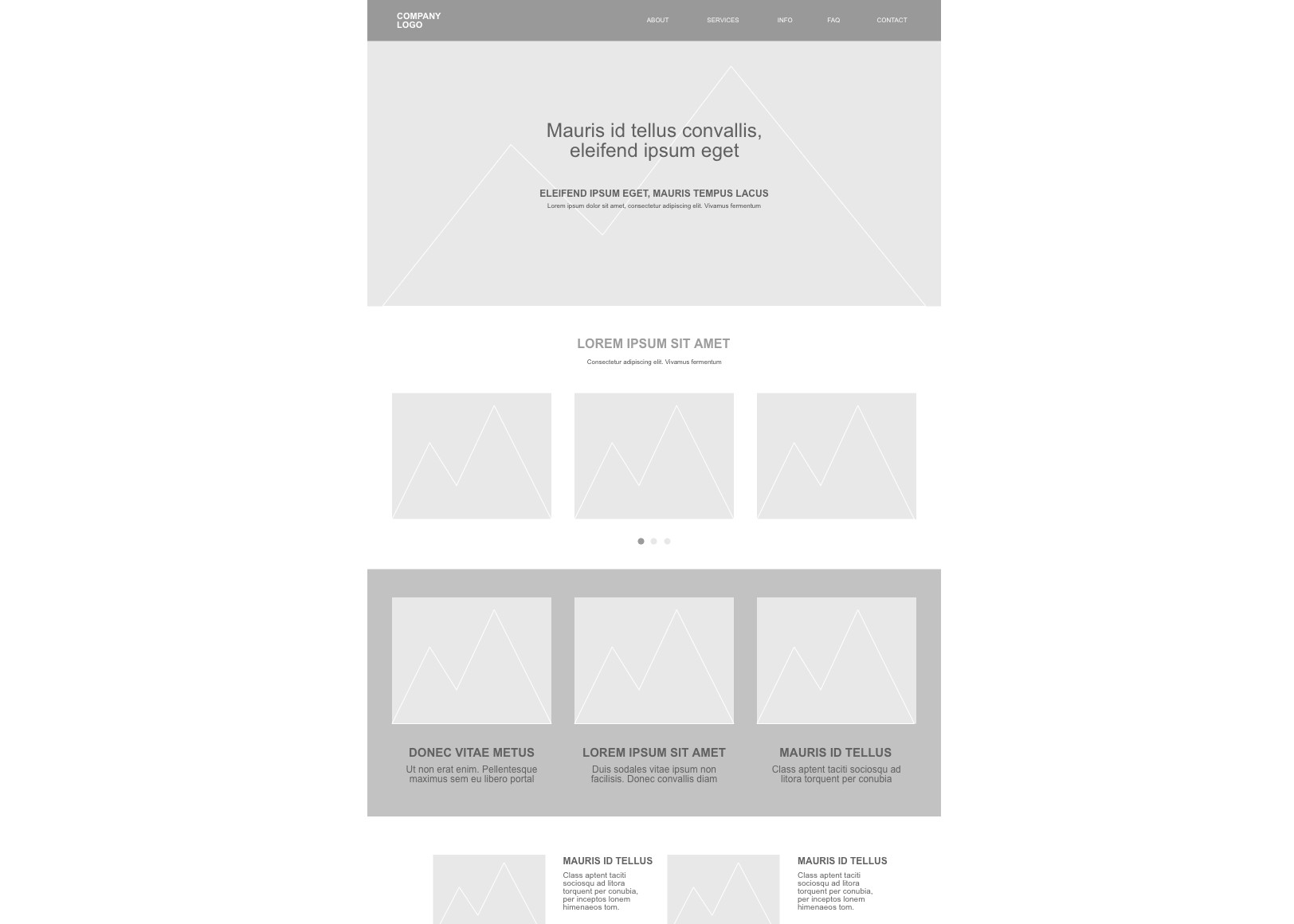
At this point, we’ve discussed the importance of prioritizing content structure, navigation, and placement. One way to put these principles into action is by working from a wireframe template. Templates are already scaled down to allow easy customization, but they’re also pre-optimized to provide a clean, organized interface. Consider the wireframe example below.

The layout is structured to follow the typical path of reading — top to bottom and left to right. The text of the hero image features different sizing to present information in order of importance.
At the top of the page, the navigation bar is the first thing a viewer sees. The images and content boxes are spaced out to reduce clutter and make the entire page visually attractive. And lastly, the slider image box is highlighted to draw attention to key actions that may interest the user.
Final words
Your wireframes should strive to achieve the core principle of web design and content marketing: First, give visitors what they want, and then they might give you what you want.
Content may drive your traffic, but these elements working together create the road to conversion. Prioritize accordingly.
This post was originally published on November 1, 2017, and updated most recently on December 22, 2021.
About Author
Cacoo Staff
Guest authorCacoo by Nulab is the collaborative diagramming software for modern teams. Use it for project diagrams, workflow planning, brainstorming, online whiteboarding, presentations, and more to keep your team on the same page.


