Ever been on a poorly designed website? Broken and misdirected links take you around in circles. Important information is hidden away in drop-down menus. Or, you go through a confusing checkout process and never once see an order confirmation. It’s a nightmare. If you’re like most people who encounter this, that first visit is usually your last.
Website design has come a long way, and users expect a seamless experience with the websites and apps they use. Patience for bad designs is lower than it’s ever been — so designers and dev teams really need to be on their A-game.
Usability testing ensures that the website or app you create is working as it should, and a cognitive walkthrough is one quick, easy, and cost-effective version of this. Here’s how to start.
What is a cognitive walkthrough?
A cognitive walkthrough is a usability test that helps designers determine whether a system’s task workflows reflect the thought process of a first-time user. The goal is to identify potential challenges and develop interfaces in which new users can easily learn how to perform system tasks.
For example, a test on an eCommerce site might assess whether a customer can add an item to their basket and pay for it. Cognitive walkthrough testing is one way to see whether the process is as seamless as it could be (and if it isn’t, work out why and what you can do about it).
A cognitive walkthrough is task-oriented. It’s based on the idea that, given the option, people prefer to navigate around a site via tasks rather than by following instructions or manuals.
The rise of graphical user interfaces (GUI)
Before we discuss cognitive walkthroughs in detail, it’s crucial to understand how user-centered design came to be. Until the late 1970s, computers had text-based interfaces, which meant users had to type in every command via the keyboard. Unsurprisingly, personal computers for consumers didn’t exist, and computing, in general, was mainly a tool of developers and engineers.
The world of computing began to change in 1979 when a team led by Charles Thacker developed the Xerox Alto at the Xerox Palo Alto Research Center. This innovative prototype included a graphical interface and a three-button mouse. For the first time, developers could interact with programs and icons to complete specific tasks, instead of a blank command prompt.
Along came Steve Jobs, who toured the Xerox facility and used the company’s work on GUIs to develop new public-facing products at Apple. While Apple’s initial attempt, the Lisa, was an expensive flop, Jobs’ team went on to develop the successful Macintosh computer in 1984.
A brief history of cognitive walkthroughs
Graphical interfaces made computers accessible to the general public. As a result, technology leaders realized companies that focused on better ‘design thinking’ would continue to drive the industry forward. Throughout the 1980s and ’90s, developers debated the best ways to improve interactions between human users and computers.
One of the most influential voices was Don Norman, a cognitive scientist who authored The Design of Everyday Things. In his work, he outlined the cognitive stages a user goes through when performing any action and how to cater to this thought process. He later became the first User Experience Architect at Apple in 1993 and co-founded the famed UI/UX consulting firm, the Nielsen Norman Group, in 1998.
Norman’s research (and many others) inspired another group of thinkers to search for a proven method of evaluating the usability of a design. In the early 1990s, Cathleen Wharton, John Rieman, Clayton Lewis, and Peter Polson introduced the cognitive walkthrough process, starting with their paper, “Testing a walkthrough methodology for theory-based design of walk-up-and-use interfaces.”
How cognitive walkthroughs influence design thinking
One of the group’s most influential papers was “The Cognitive Walkthrough Method: A Practitioner’s Guide,” published in 1994. Jakob Nielsen of the Nielson Norman Group included it as a chapter in his book Usability Inspection Methods, which quickly made cognitive walkthroughs a staple of the design world.
According to this model, people learn best through exploration, learning, and guessing, rather than following instructions. During this process, testers follow the system responses and use them to try and achieve the task goal.
Here are questions testers will unconsciously ask themselves while using the system:
- What do I need to do first to get closer to my goal?
- Did that work? If so, show me the next step. If not, show me where I went wrong and help me find a way to get back on the right track.
This is what a cognitive walkthrough essentially is — a process that involves looking at how the user interacts with the interface and assessing problems that stop them from being able to reach their goal.
Benefits of cognitive walkthroughs
Compared to other forms of usability testing, cognitive walkthroughs are speedy, easy, and affordable to implement. You can also run them early in the design phase before the project goes to the dev team. This step provides vital insight before you spend too much budget on developing features you will need to eliminate or redesign.
Who should conduct a cognitive walkthrough?
Cognitive walkthroughs work best when the tasks are given to testers who aren’t already familiar with the interface. Someone who has a rough idea of how it works will often miss problems because they know what they’re doing and how to avoid issues — often unconsciously.
A tester with little or no experience using your interface is more likely to think like a first-time user. They’ll be able to pick up on issues others may have missed. If you’re worried the user won’t know how to navigate certain things because they’re not quite finished, you can write down basic instructions or oversee the test and step in if needed.
How to run a cognitive walkthrough
Step 1: Preparation
Define: before you begin, it’s a good idea to define your test and user goals. This can be a simple list of actions the user wants to complete.
Describe: for this stage, describe your average user. What are their probable goals, and how will they interact with the system? In some situations, one system may have multiple types of users. For example, a lecturer may use an online blackboard tool one way while the student uses it another.
Detail: define user goals in relation to your own goals. Note down all the steps they need to take to reach that goal. There may be extra tasks the user does in addition to those being assessed, but you don’t need to include these. The cognitive walkthrough should only focus on the tasks you’re analyzing.
An example task flow for an eCommerce site might look a bit like this:
- Open site
- Navigate to the ‘shoes’ category
- Filter by color
- Filter by size
- Select item
- Add to cart
You can set the instructions out in a list, or if the process is more complex, with several options branching out as the user progresses. A flowchart diagram like the one below could be helpful.

Step 2: Kick-off
Pen and paper at the ready — it’s time for your user to interact and give feedback. You can run the test digitally or use print-outs of each screen.
Four important questions to ask during a cognitive walkthrough
It’s important to always keep user needs in mind. Asking the following four questions can help you stay on track while the testing goes on.
These four questions come from “The Cognitive Walkthrough Method: A Practitioner’s Guide, and they’re still the gold standard to this day.
Question 1: Will the correct action be sufficiently evident to the user? (In other words, will users know what they need to do?)
The goal here is to see whether the interface is intuitive or you’ve made incorrect assumptions about the user experience. If it’s the latter, the user won’t know what to do.
This stage can also help you work out whether user actions align with user expectations. If users easily get lost or have to use other things as reference points, there’s a problem. For example, if you have two tabs with the same or similar names, the user might note the position of each tab to help them navigate. While this method does work in some instances, it’s not ideal or intuitive.
Question 2: Will the user connect the correct task description with what they’re trying to do? (In other words, will they notice the right action that’s available to them?)
This part of the test looks at whether users can pick out the right tools, tabs, or buttons. Let’s say the user wants to see their Favorited items. If there are too many buttons on the screen, they might not spot the little heart.
One option is to limit the visible data by hiding it in a drop-down menu. But be careful about what you put there. If you bury an important tab in a hidden menu, the user will struggle.
Top tip: Keep analysis paralysis at bay by limiting the choices available. This also lowers the user’s chance of making a mistake.
Question 3: Will the user correctly interpret the system’s response to the chosen action?
When the user clicks or drags something, they’ll scan all the options available and then choose the one they think will take them closer to their goal. If there are too many options, none seem correct, or the options are poorly written, the user will struggle.
Question 4: Will the user be able to see their progress toward their goal?
Few things are more annoying (and disconcerting) than clicking’ pay,’ only to be navigated to the homepage or an error message.
This is just one example of why it’s important to show users what’s happening when they interact with a system. For example, adding a ‘thank you for your order’ message after checkout or a green checkmark next to something that’s been submitted are easy ways to confirm an action. Feedback is essential because it shows users that they’re moving forward or finished with the process and don’t need to do anything else.
Top tip: if you’re crunched for time, it might be tempting to design as you go. Make sure there’s a ‘no designing’ rule during the analysis stage. Instead, focus on finding problems, documenting them, and generating ideas for solutions. Any further design can wait until those stages are complete.
Cognitive walkthrough vs. heuristic evaluation
A cognitive walkthrough is a task-based usability inspection method. Testers are typically unfamiliar with the system and focus on evaluating the ease and intuitiveness of completing a specific task.
Heuristic analysis is another popular form of usability inspection created by Jakob Nielsen and Rolf Molich. This method depends on ‘heuristics’ — a predetermined set of guidelines or principles for investigating a problem or solution. Heuristic principles vary between different models, but the following are common criteria:
- User control
- Cognitive simplicity
- Accommodation
- Flexibility
- Linguistic clarity
- Precision
- Predictability
- Responsiveness
- Goal fulfillment
While it’s similar to a walkthrough, heuristic evaluation is usually performed by expert usability testers with a thorough understanding of what the developer hopes to accomplish. Since both models emphasize user-centered design, they do overlap in terms of design goals.
Next steps
Proper documentation is a vital part of the process. If the answer to any of the above questions is ‘no,’ then you’ll need to take note. It’s a good idea to gather all these questions together and store documentation in one online place, so designers and developers can prioritize the tasks and access the list with ease.
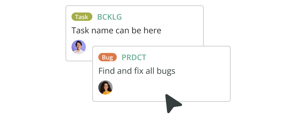
Project management software is a good option for managing cognitive walkthrough steps. Online Kanban boards and real-time notifications get teams communicating and collaborating — meaning no tasks are missed or done twice due to information gaps.
Final thoughts
Cognitive walkthroughs are a great way to put yourself in the user’s shoes. They’re fast and straightforward, and the product doesn’t have to be finished before conducting the walkthrough. So, teams can quickly find problems early in the process and make adjustments before spending too much money on development.
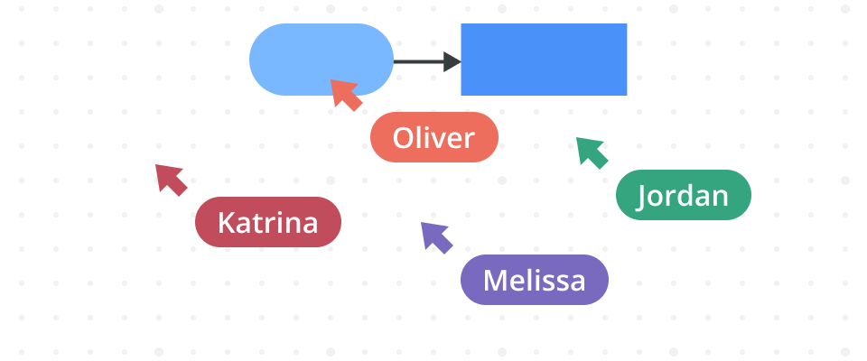
To get the most out of your cognitive walkthrough, use diagramming software to do all your testing and planning. Cacoo, our own diagramming tool, includes a repository of editable diagram templates, plus handy features such as version control, live comments, and multi-user editing. This makes feedback and sharing so much easier. Developers, designers, and users can all work together on one easy-to-use platform.
This post was originally published on November 6, 2020, and updated most recently on February 24, 2022.
About Author
Georgina Guthrie
Guest authorGeorgina is a displaced Brit currently working in France as a freelance copywriter. Before moving to sunnier climates, she worked as a B2B agency writer in Bristol, England, which is also where she was born. In her spare time, she enjoys old films and cooking (badly).


