A digital dashboard is a place where you can get an overview of data at a glance. When done well, it informs data-based decision-making and helps users glean quick insights. A poor dashboard design, on the other hand, confuses or even bores viewers.
These full-screen displays can feature charts, graphs, maps, lists, gauges, and more to help users quickly make sense of complex data. And with our help, you’ll know exactly which dashboard design principles will best serve your users — and why.
Why dashboards are an important element of UI/UX design
Picture a typical week of your life. How many online services do you use within that timeframe? Chances are, you use online banking, social media, retail services, food-delivery apps, utility providers, and entertainment apps. Depending on your occupation, you might use tools ranging from CRM and POS systems to project management and financial analysis software.
Now, think about how many of these applications or websites include a dashboard. Undoubtedly, interacting with various dashboards is something you do several times a day, making the user experience more streamlined.
Beyond the user benefits, investing in a well-planned dashboard UI design is valuable for businesses, especially SaaS. Here’s why.
Customization for multiple users
In professional settings, it’s normal for several team members to access the same account. Based on their roles, these team members may have different priorities when looking at data. Customizable and filterable dashboards make it possible for users to adjust the information in the dashboard view to gain the specific insights they need.
A dashboard design that delivers this level of customization with ease can potentially improve productivity across entire teams.
Customer retention
Dashboards are an effective retention tool because they reinforce the product’s value. When people use software and services, they’re either trying to perform an action, solve a problem, or get answers to challenging questions. The data isn’t only useful to the customer; the business is simultaneously gaining information about user behavior.
The more customers interact with the dashboard, the more you can learn about their needs and create a better experience for other users. At the same time, you can leverage these powerful reporting tools to show customers what they’ve achieved by using your service — and keep them around.
Onboarding
Onboarding and retaining users who don’t typically respond to outreach attempts can be a challenge. You don’t know what they’re thinking, and too much prompting can scare away standoffish customers for good.
For these more self-sufficient users, a dashboard provides insight into whether or not the product is serving their needs. Even if you can’t reach these users directly, you can supply enough information to demonstrate the benefits of the service.
So, as you delve into dashboard design, think about common problems, goals, or questions users hope to address as they navigate the interface.
How to design a dashboard your users will love
Dashboards shouldn’t show everything at once. Too much data looks cluttered and can overwhelm the user, who ends up delaying or failing to act as a result. Instead, think of your dashboard like the blurb to a book: it’s a summary that gives you a top-level overview, which you can drill down on later.
As a general rule of thumb, a dashboard should do the following:
- Show only the most important information
- Draw attention where it’s needed
- Help users understand the data so that it becomes an insight
- Arrange the data so that it’s easier to respond quickly
- Show performance measures, trends, risky areas, progress, and stats
First, work out which type of dashboard you need
Analytical dashboard
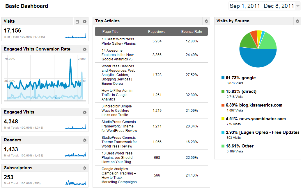
Analytical dashboards provide a comprehensive summary of key performance trends. They’re designed to help users make insightful decisions by displaying related metrics or goals. Below is an example of a marketing dashboard from Google Analytics. A marketer, content manager, or copywriter would use this type of dashboard to plan and monitor an organization’s content strategy.

Operational dashboard
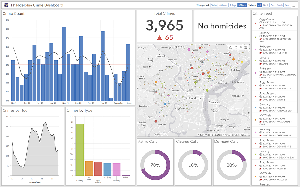
Like the real-life car version, an operational dashboard gives users crucial, time-critical information, such as resources and status. They’re designed to help users make fast decisions. Below is an example of a dashboard used by the Philadelphia police department.

Strategic dashboard
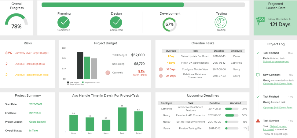
A strategic dashboard is a reporting tool. It helps the user keep track of KPIs — and as such, it’s often used by project managers or execs. A strategic dashboard updates regularly but is less time-crucial than an operational dashboard. Think daily rather than minute-by-minute.

When you’re choosing your dashboard, think about your end user. Project managers and high-level executives will probably need a strategic or analytical dashboard. Lower-tier managers and people in time-sensitive jobs — like emergency services phone operatives — will use an operational dashboard.
Choose your charts wisely
Dashboards feature charts and graphs. Why? Because displaying complex data visually makes it easier for the user to process. Before you dive in, it’s important to choose the right chart for the data you want to display. Pick the wrong one, and you could be making it harder for your user to interpret the information.
Below is a guide to the most common needs, along with the charts to match.
I want to…
See the relationship between things
- Scatter chart
- Network diagram
- Bubble chart
See distribution
- Scatter chart
- Bell chart
- Histogram
- Mekko chart (or mosaic chart)
Compare things
- Bar chart
- Circular area chart
- Column chart
- Line chart (over time)
See the composition of data
- Pie chart
- Sunburst chart
- Heat map
- Waterfall chart (over time)
- Stacked chart (over time)
Chart design best practice
When creating your chart, remember to make it clear and consistent. Dashboards contain a high quantity of information, so you need to make that data easy to interpret at a glance. Here are some general tips:
- Color-code your charts. Limit yourself to a few shades, and be consistent. For example, if you’re collecting demographic data for 18 to 30-year-olds, make sure every chart associated with this group is given the same color throughout. Uniformity makes it easier to find what you’re looking for.
- Oh, and watch out for ‘traffic light’ colors (red and green especially). Most people associate these with ‘stop’ and ‘go.’ Only use them where appropriate; otherwise, you’ll confuse your user.
- Be consistent when you name your data. Stick to the same naming conventions throughout the layout to avoid confusion.
- Preserve the integrity of the data. Avoid presenting the graphics in ways that distort the data to make it appear more or less favorable. The visual proportions in your graphs and charts should show an accurate relationship between different data sets.
- Use professional software. When you’re making charts, use the right tools for the job. Diagramming software is specifically created for charts and graphs, and many come with a library of templates to choose from, which saves you time designing from scratch. You can then export and integrate your chart into your dashboard design.
- Keep your charts simple. Stay away from any designs that look like they were made in Clip Art. So, no patterns, 3D effects, shadowing, or rainbow color schemes. Just no.
Next, create your dashboard layout
Once you’ve created your charts, it’s time to populate the dashboard with widgets, cards, and data tables. The first thing to consider is the dashboard user flow. Again, it’s essential to put yourself in your viewer’s shoes and think about how they’ll digest the information.
Start with a grid (wireframing software can help you here) and think about visual hierarchy.
Follow conventional layouts, so your users know what to expect. Put headers above text and charts and menus at the bottom, left or right. Highest-priority information should be at the top, with lower-priority data at the bottom or behind icons or drop-down menus.
Other factors that affect hierarchy (aka the order in which we view information) include color, size, contrast, proximity, white space, alignment, repetition, and texture. You should use any or all of these techniques to draw attention to the most critical elements of your dashboard first.
Tip: In America and Europe, our eyes naturally start in the top left-hand corner and scan right because that’s how we read. But bear in mind that international audiences may not be the same. For example, in Japan, audiences read vertically, from top to bottom and right to left. If in doubt, turn to size and contrast to focus the eye, rather than layout.
Dashboard design best practice
Include lots of white space. The aim isn’t to cram as much info into your dashboard as possible; it’s about clearly presenting select information. Use around 5 to 7 widgets to create your view — any more, and you’ll overwhelm the user. If you do need to include more information, then…
Keep it minimal. Tuck extra information away behind drop-down or expandable menus, pop-ups, and accordions. And use more icons instead of headings. But also…
Don’t rely too heavily on icons or scrolling dashboards. Keep in mind the point is to be able to see rich information at a glance. Adding too many interactive elements negates the benefits of having a dashboard. And information hidden further down or behind an element is more likely to be ignored than anything on the primary screen.
Treat your dashboard as a clothes designer would treat a fashion show: create everything you need, then refine and display the key pieces. Remember: distill, evolve, and prioritize.
Make sure your design is balanced. It needs to have a cohesive feel with margins of equal size and balanced negative space. Failing to do this creates unnecessary visual distractions, which makes the data harder to digest.
Personalize the content. Think about who your customers will be, and configure the dashboard so that the information most relevant to them is on display. If you have several different types of users, configure your dashboard so that it automatically re-prioritizes the information according to what’s relevant to each user.
And finally, put it all together
And now for the best part: this is where you pull everything together and start designing your different views. You can also adjust things like colors, font sizes, and texture to make the whole effect aesthetically pleasing and cohesive. While you’re populating and arranging everything, remember to tweak, edit, and evolve. Ask for feedback. And most importantly, prioritize simplicity over everything else.
This post was originally published on January 15, 2020, and updated most recently on January 26, 2022.
About Author
Georgina Guthrie
Guest authorGeorgina is a displaced Brit currently working in France as a freelance copywriter. Before moving to sunnier climates, she worked as a B2B agency writer in Bristol, England, which is also where she was born. In her spare time, she enjoys old films and cooking (badly).


