Flowcharts answer problems; good flowcharts answer problems directly and efficiently. Master these flowchart rules and best practices, and you’ll be able to create easily comprehensible visual solutions.
Keep these tips in mind to avoid overcomplicating the design as you get started with your next flowchart.
Preparing for flowcharts
Before anything else, you must first prepare and research all aspects of the issue you’re dealing with and all possible solutions or branches that the process could take. You can’t make a well-organized flowchart if don’t know what options are available and when.
Once you’re ready to start charting how all of these options fit together, you just need to select a tool to use, like our online diagramming software Cacoo. (You can start a free trial of it if you want to try out everything we’ll discuss below.)
Formatting flowcharts
While the processes that flowcharts visualize require a lot of creative problem-solving to design, flowcharts themselves are formulaic. Save the creative liberties for other design projects. The foundations of flowchart rules and design are set in stone at this point.
Flowchart rules to follow
There are a few key rules that go for all flowcharts:
- Always format your flow from left to right or top to bottom.
- Run your return lines under your flowchart, ensuring they don’t overlap.
- Maintain consistent spacing between symbols.
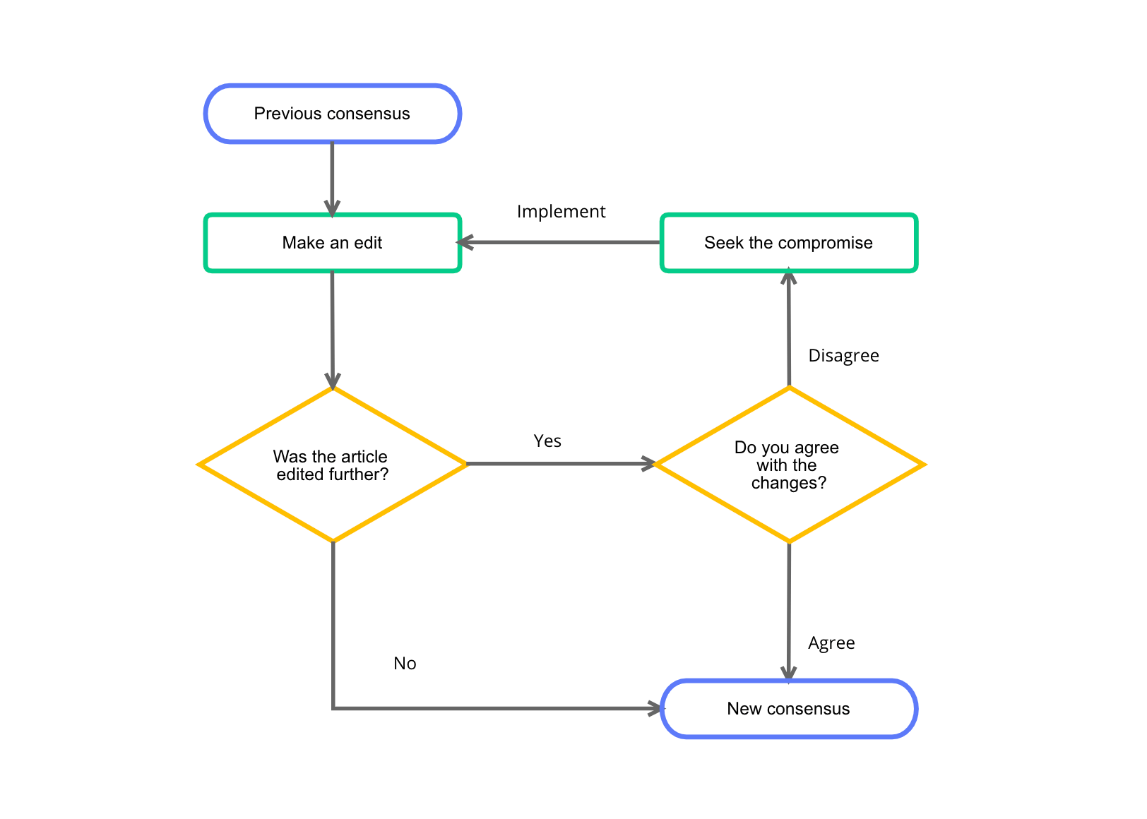
- Use the correct symbol for each step (diamond shapes are for decisions, rectangles are for processes, and start/end shapes should be the same, etc.)

Other flowchart rules are more flexible. In the case of capitalization, the opinion is changing. Banning all caps was once standard. However, today, many high-quality flowcharts have found ways to use all caps without occupying too much space.
Proper sizing
One of the most user-friendly flowchart rules to follow: keep it to one page. People get lost jumping between pages, rendering your flowchart unreadable. If you find your chart exceeding one page, and you can’t edit any further, break it into multiple charts — each chart also sticking to the one-page rule.
If you find yourself struggling to condense a flowchart, consider:
- Re-reading it out loud. Deleting redundant words or finding shorter synonyms can save you valuable lines that add up when you require a little more space.
- Resizing your diagram. Keep in mind your image’s resolution. Don’t go so small that the font becomes blurry or illegible.
- Playing with fonts. Some business standard fonts are larger than others. Font size also comes into play. Consider scaling that 16 font down to a 14.
Above all else, remember to keep your formatting changes consistent. If not, your flowcharts are sure to look unprofessional and disorganized. Minimalist designs make errors much easier to catch, which is great for proofing your flowchart but not so great if you forget to resize one of your flowchart shapes to match the rest.
Ensure accuracy
While this isn’t on a formal list of flowchart rules, it’s a best-practice: review each element of your work thoroughly, from design to grammar. Double-check that you’re using the right symbols. Check for consistent fonts and colors. Take a few steps back from your screen, and see if anything stands out that you didn’t notice close up.
These may seem like obvious steps, but you’d be surprised at how many simple errors slip through the cracks. Strive for polished consistency every time.
Designing flowcharts
Creative designers, don’t get us wrong: your work is vital to countless projects. However, your creativity needs to be a bit more Frank Stella and a little less Basquiat when it comes to flowcharts. In short, keep it minimal.
Designing with a purpose
First and foremost, a flowchart should clearly demonstrate a flow, like a team hierarchy, operational procedure, or workflow. Their functional purpose is to help people understand how something works. If the page’s ornate design delights the eye but confuses the viewer, you’ve gone too far.
Because the formatting for flowcharts is so structured, most design choices will come down to colors, fonts, and lines. And a lot of creativity can still go into these!
When used effectively, colors can help highlight key elements. You can use color to delineate responsibilities or highlight important areas. Just don’t go overboard. A simplistic palette is a strong choice when it comes to flowcharts.

Flowchart symbols
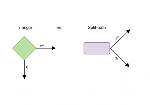
Much like the evolution of using all caps, some design elements have become more flexible over time. The decision symbol, traditionally represented as a diamond shape, is now sometimes represented with a split-path symbol.
Some feel that the diamond symbol is less known to readers and can confuse the flowchart if it breaks the left-to-right text format we mentioned. Instead of dividing at a 90-degree angle as the diamond symbol does, split paths use a forked approach that eliminates the possibility of breaking the standard reading format.

Triangle vs. Split-path
Opinions vary, so choose what works best for your chart. Whatever you decide, remember to include a flowchart legend. As options and opinions vary, providing a key ensures that your readers always understand your work. These may not be the most complex art decisions you make, but they can significantly impact your flowchart’s readability.
Adding cross-functionality
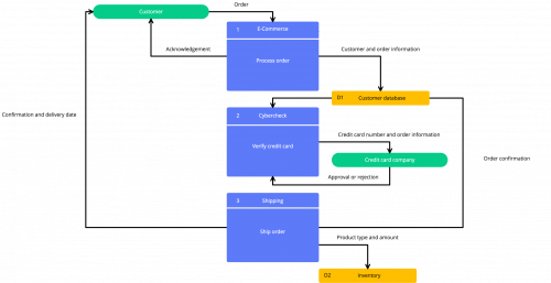
After you’ve mastered all these aspects of your flowchart, you can add another dimension. Making a flowchart cross-functional means that it shows the process or setup and shows the relationship between the steps.
The flowchart can use colors, symbols, or labels to show which member or department is in charge of each step or even milestones that need to be hit between each step. While the cross-functional flowchart is a bit more complicated, it provides miles more information than one that just shows the system.
Flowchart conventions
When creating flowcharts, adhering to certain conventions will ensure clarity, consistency, and ease of understanding. Here are some essential flowchart conventions to keep in mind:
- Standard Symbols: Utilize the standard symbols for commonly used elements in flowcharts. Consistently using these symbols across different flowcharts improves readability and comprehension.
- Clear Labels: Clearly label each symbol and connector to indicate its purpose or function within the flowchart. Use concise and descriptive text to convey information without unnecessary ambiguity. Avoid using abbreviations or jargon that may not be universally understood.
- Logical Flow: Ensure that the flow of the chart follows a logical sequence, with each step leading logically to the next. Avoid convoluted paths or abrupt transitions that may confuse readers. Use connectors and arrows to illustrate the flow of control or data between different elements of the flowchart.
- Consistent Formatting: Maintain consistency in formatting throughout the flowchart, including the size, style, and color of symbols, text, and connectors. Consistent formatting enhances visual coherence and makes it easier for readers to follow the flow of the chart.
- Modularity: Break down complex processes into smaller, more manageable modules or subprocesses, each represented by a separate flowchart or subflowchart. Modularizing flowcharts improves readability and allows for easier comprehension of complex processes.
- Hierarchy: Clearly define the hierarchy of processes, decisions, and subprocesses within the flowchart. Use indentation, alignment, or visual cues such as color or shape to indicate levels of hierarchy and relationships between elements.
- Annotations and Comments: Include annotations or comments where necessary to provide additional context, explanation, or clarification. Annotations can help readers understand the rationale behind certain decisions or the significance of specific steps within the flowchart.
- Testing and Validation: Test and validate the flowchart with stakeholders or end-users to ensure accuracy, completeness, and effectiveness. Solicit feedback and iterate on the design based on user input to improve usability and utility.
Four flowchart problems (and how to avoid them)
1. The flow is difficult to follow.
A disorganized flow usually results from placing flowchart shapes too close together or making connectors that are hard to see. Before you design, try listing the different process steps in groups that make up a ‘zone.’ Once you have a clear idea of how much space you need, you can carve out a zone that’s adequate for the set of steps.
And as for the connectors, make the lines prominent enough for anyone to see them. Avoid using very long or winding connectors that weave around shapes, as this can be difficult to follow. Readers may lose their place and continually backtrack to remember what they previously viewed. The return lines are typically the only ones that need to have a longer extension.
2. The descriptive labels aren’t intuitive.
Whether you’re creating a simple or complex flowchart, the language should be as concise and straightforward as possible. Awkward phrases, drawn-out sentences, and overly technical jargon are a no-go (if only tech-literate readers are using it, you can make an exception).
Before adding text to your flowchart, give your labels a once-over to remove any superfluous words that don’t add clarity. The simplest phrasing that gets your point across is best. Have teammates review your chart to make sure all the steps are understandable to others.
3. The forks aren’t clearly defined.
If your process has forks, make sure the decision paths are easy to differentiate. Let’s say you’re charting the question, “What new hobby should I pursue?” The next question asks whether you prefer to do something indoors or outdoors.
Readers may feel confused if your connectors go straight to the options’ gardening’ and ‘dancing. It’s a good idea to include a step in between each destination that clearly identifies the choice ‘inside’ or ‘outside.’ This helps to bring balance to the layout and makes the design easy to skim.
4. The graphics are harsh on the eyes.
Creative flowcharts have their place, but in many cases, they aren’t very good at relaying information. Common design issues that affect readability include:
- Overuse of images: incorporating too many images leads to a complicated flowchart. Use them sparingly in areas with plenty of open space to cleanly navigate connectors around the graphics. You should also avoid using images as a substitute for process steps. Text eliminates the possibility that someone will misinterpret the information.
- Poor color contrast: backgrounds and color schemes shouldn’t interfere with the process you’re trying to visualize. A simple white or neutral-colored background is usually the best option. The process shapes should distinctly stand out from the background, and the text should stand out from the shapes. Don’t force people to strain their eyes.
Goals of flowcharts
To create useful flowcharts, it’s important to understand the goals of the flowchart to ensure that you achieve them.
Flowcharts can serve many essential purposes in various fields, contributing to improved understanding, communication, and decision-making. Here are the primary goals of flowcharts:
1. Visual representation
One of the primary goals of flowcharts is to visually represent complex processes, systems, or algorithms in a clear and intuitive manner. By using standardized symbols and connectors, flowcharts provide a graphical depiction of the sequence of steps, decisions, and interactions involved in a process.
2. Process documentation
Flowcharts are commonly used to document and communicate business processes, workflows, and procedures. They serve as visual aids for documenting standard operating procedures (SOPs), guidelines, and best practices within an organization, facilitating consistency and alignment in process execution.
3. Analysis and optimization
Flowcharts enable thorough analysis and optimization of processes by identifying bottlenecks, inefficiencies, or areas for improvement. They help stakeholders visualize the flow of a process, analyze each step’s effectiveness, and identify opportunities for streamlining, automation, or refinement.
4. Decision support
Flowcharts aid decision-making by visually mapping out different options, scenarios, and outcomes. They help stakeholders evaluate alternatives, weigh pros and cons, and make informed decisions based on logical reasoning and evidence. Flowcharts provide a structured framework for analyzing complex problems and identifying the most suitable course of action.
5. Communication and collaboration
Flowcharts serve as effective communication tools, allowing stakeholders to visualize processes and discuss potential improvements or changes. They facilitate collaboration among team members, enabling shared understanding, brainstorming, and problem-solving. Flowcharts help stakeholders align their goals, expectations, and strategies by providing a common visual reference point.
6. Training and education
Flowcharts are valuable educational tools for training employees, students, or stakeholders on complex processes or procedures. They simplify complex concepts, break down tasks into manageable steps, and provide a structured framework for learning and comprehension. Flowcharts help individuals understand the logical flow of a process and the relationships between different elements.
7. Standardization and compliance
Flowcharts promote standardization of processes by documenting best practices, standard operating procedures (SOPs), and compliance requirements. They serve as references for ensuring consistency and adherence to regulatory guidelines, industry standards, and organizational policies. Flowcharts help organizations maintain quality, efficiency, and compliance in their operations.
8. Continuous improvement
Flowcharts support continuous improvement initiatives by facilitating the identification of opportunities for optimization and innovation. They enable organizations to track process performance, monitor key metrics, and implement changes based on feedback and lessons learned. Flowcharts promote a culture of continuous learning, adaptation, and innovation within an organization.
By aligning with these goals, flowcharts become powerful tools for enhancing organizational efficiency, effectiveness, and competitiveness across various domains. They enable stakeholders to visualize, analyze, and optimize processes, leading to improved performance, decision-making, and outcomes.
Incorporating flowchart rules ensures clarity and consistency in the representation of processes, further enhancing their effectiveness as communication and decision-support tools.
Flowchart rules and tools
Creating a flowchart isn’t as easy as it may seem. But all it takes is an eye for detail and a basic understanding of a few industry standards to get started. Templates can also help speed up the process while you’re still defining your flowchart rules. With these helpful tips and our Cacoo diagramming tool, you’ll be on your way to creating functional and beautiful flowchart diagrams for your team.
This post was originally published on August 21, 2017, and updated most recently on May 6, 2024.
About Author
Cacoo Staff
Guest authorCacoo by Nulab is the collaborative diagramming software for modern teams. Use it for project diagrams, workflow planning, brainstorming, online whiteboarding, presentations, and more to keep your team on the same page.


![[Flowchart] Where to donate on International Women’s Day](https://cdn.nulab.com/learn-wp/app/uploads/2020/02/14210852/05-blogInternationalWomansDay-.png)
![[Flowchart] What Thanksgiving side dishes should you bring?](https://cdn.nulab.com/learn-wp/app/uploads/2019/11/14210711/Cacoo-Flowchart-What-thanksgiving-side-dishes-should-you-bring-this-year_-Blog.png)

