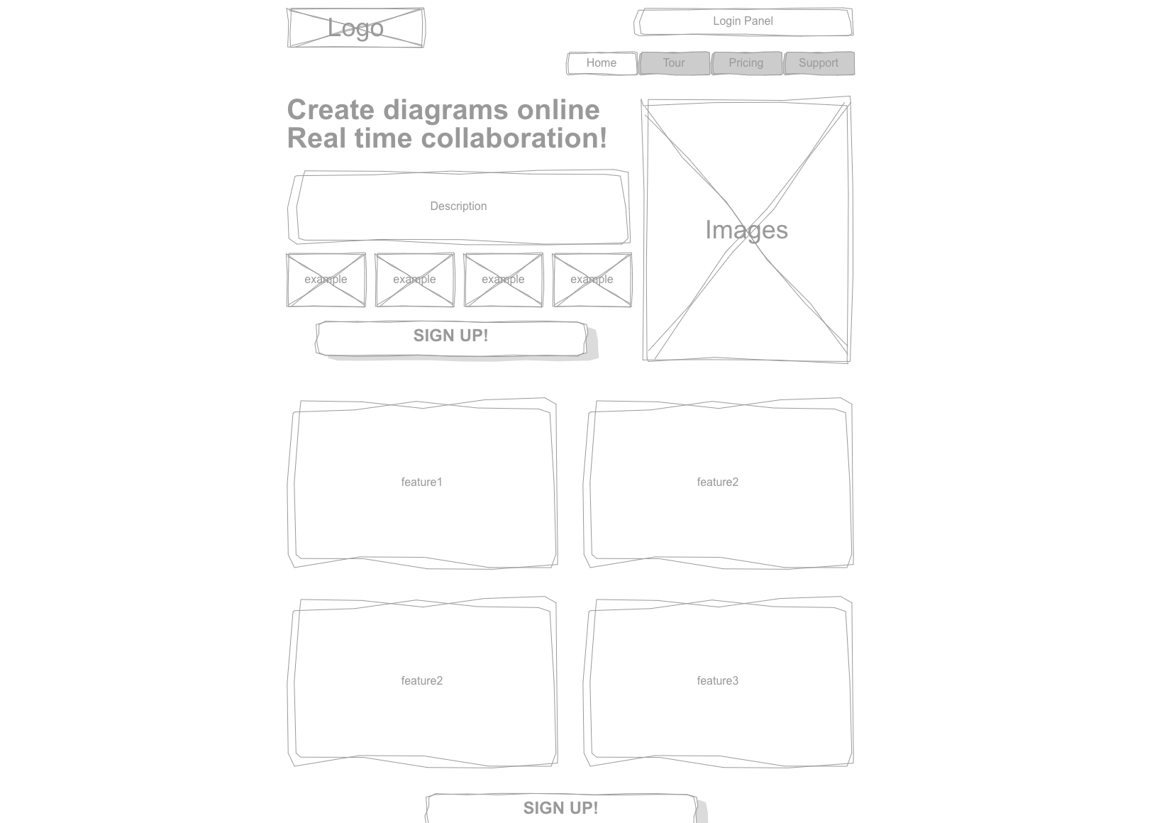
Evaluating wireframes requires you to think about the purpose of each component on a page. Together, the components should provide a cohesive user journey, and the wireframes allow you to explore it before creative work gets underway. Overall, the final product will be better if you provide feedback that helps clarify the consumer journey.
Why wireframes are essential to the web design process
Wireframing may seem tedious, and you might consider skipping this step. But that would be an incredibly short-sighted decision. Wireframes are the foundation for your site’s layout, aesthetics, and functionality. Without it, you will spend a lot of time backtracking when these various elements don’t work together as you expected.

What are wireframes, and why do you need them?
A wireframe is a barebone, black-and-white blueprint of your website design. It provides a visual outline of your site structure and how items like images, content, and CTA buttons are situated on each page. The wireframe allows you to assess crucial details before investing in a higher-quality mock-up.
Wireframes are beneficial for:
- Designing an intuitive, uncluttered user experience
- Improving usability at the most fundamental levels
- Breaking down the design process into manageable stages
- Creating a tangible prototype for stakeholders
- Identifying design or aesthetic issues as soon as possible
- Refining the layout and goals of your web content
- Tailoring the user experience for different digital devices
There are different types of wireframes that each serves a unique purpose. Regardless, they all aim to solve the same problem: how to use design to trigger specific user actions. Direct your attention to these seven key areas when giving feedback on wireframes.
Goals
Evaluation is impossible if you don’t understand the goals of a project. Ask for well-defined goals, and then evaluate the effectiveness of the wireframes based on how the designs serve the overall objectives of the project.
Call out elements that are clouding the project’s intentions or contradicting the stakeholder’s requests. With each frame, ask: how is this serving the greater user journey?
As projects progress, what stakeholders want can change. That’s why it’s so important to start with a standard wireframe that accurately delivers the stated goals. You don’t want your team to fall into the mistake of getting too creative too quickly and then having to redo their hard work.
Visuals and branding
Visuals and branding are usually minimal at this stage in the design process, so they don’t dominate the structural importance of the wireframes.
If your team wants to adjust mainstay wireframe elements like colors, fonts, and shapes, suggest that they don’t. These treatments may seem trivial, but they can easily confuse stakeholders, cause rifts between UX and design, and impact overall cohesion.
When evaluating visuals or branding, focus on clarity. Regardless of how complex a project may be, don’t allow designs to veer away from standard style points.
Navigation
Bad navigation can impact UX, SEO, and other critical aspects of a project. If you fail to catch navigation errors in your wireframe, you could cost your design or dev teams a lot of time down the line. The technical education website Treehouse states:
“Areas like navigation and layout determine how the rest of the project proceeds. If there’s a problem, it’s better to tackle it at the start, rather than later with hi-fi prototypes, where you may have to redo some work.”
To avoid navigation problems, put yourself in a user’s shoes. Envision each page from their eyes when providing feedback. Chances are, if you don’t feel a fluid navigation, the user won’t either. Consider these elements:
- How many clicks does it take to reach a page?
- How many steps are involved in sign-ups, points of sales, etc?
- Is important content readily available?
- How easy is it to find what I’m looking for?
If any of the answers above don’t feel right, speak up. Don’t allow work to move forward until navigation is clear.
Purpose
Much like project goals, each page should have a purpose that is communicated clearly. Ask yourself: why is this page here? What does it want me to do? Is it important that I do what it’s asking? Again, put yourself in the user’s shoes. Every page needs a specific reason for being there. Otherwise, you won’t meet your target goals.
If a page fails to support logical navigation or could benefit from modifications, state your observations. Make sure every page has a measurable purpose.
Content
Wireframes help prioritize content. When critiquing this area, think about content placement, spacing, and grouping. Consider how the layout creates a content hierarchy and how that hierarchy serves the goals of the page.
Use real content when available, since it will help you finetune the aesthetic. Otherwise, placeholder content is suitable for figuring out how the different elements should work together. Review the content for clarity. Make sure it answers the questions a user is most likely to ask when they arrive on the page. Like any other element, the content should reinforce the greater goals of the project.
Calls to Action
The CTA is an area where you may find yourself making the most suggestions. Web Ascender tells us that CTAs come before other elements:
“Forget about colors and styles, so you don’t get ahead of yourself and determine your call to action. Start by asking yourself, ‘What do I want a user to do when they get to my site? What steps do I want them to take?’ By removing the element of design, you will be able to direct your focus to these important aspects of your website.”
Evaluate whether it’s clear how visitors will engage with the page. Much like purpose and goals, the wireframe needs further work if this isn’t crystal clear. CTAs need to have straightforward goals with effective messaging. If they fail to do so, your conversions and other KPIs will suffer. Look for CTA issues in your wireframe, such as:
- Image conflicts with CTAs
- Too much or too little content
- Placement of CTAs
You may find yourself involved in several rounds of CTA edits. This is normal and all part of the feedback process. Continue brainstorming until you produce the most precise and actionable phrasing.
Layout
If a wireframe’s layout is difficult to understand, the actual design will be a nightmare. Point out areas that might confuse or overwhelm viewers. Give feedback on components such as content placement and page order.
Above all, focus on readability. One problem you run into with wireframes is trying to fit too much content on a single page.
Don’t be afraid to suggest nixing an entire section or separating one page into two. It’s important to strike a balance between content-rich and content overload. Be upfront if you feel your team hasn’t achieved this mark.
Conclusion
If you focus on these key elements, your team’s wireframes should always hit the mark. Remember, wireframes are about defining goals and ensuring utility; they’re not about beautifully polished designs.
A well-produced wireframe serves as the roadmap for your project’s success. Your feedback is integral to how the project proceeds.
Searching for the right diagramming tool?
Check out Cacoo, a cloud-based diagramming tool for team collaboration.
This post was originally published on September 5, 2017, and updated most recently on December 15, 2021.
About Author
Cacoo Staff
Guest authorCacoo by Nulab is the collaborative diagramming software for modern teams. Use it for project diagrams, workflow planning, brainstorming, online whiteboarding, presentations, and more to keep your team on the same page.


