Consider a design team that presents a screen mockup in Figma. The design looks great, but after implementation, the shade is slightly wrong, the spacing is inconsistent, and buttons across different screens behave differently. Then a feedback loop begins between the designers and developers.
This is a common story of many organizations. Designers see the vision, but when it is given to developers, they may interpret it differently. What if there were a structured, shared language of design decisions that both designers and developers could use, and that PMs could audit or refer to? That’s where design tokens step in.
In this article, you will learn what design tokens are, how they help various teams, how you can get started, the common mistakes, and the benefits.
What are design tokens?
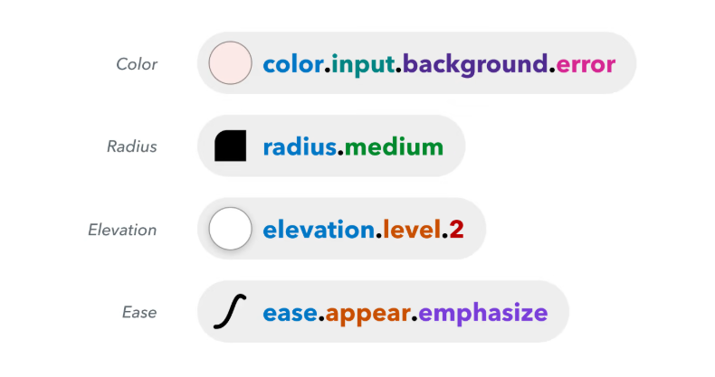
Design tokens are reusable design values, encoded in a way that humans and machines can understand. It consists of colors, spacing units, typography settings, border radii, and shadows.
For example:
- color-primary = #0055ff
- spacing-small = 8px
- font-heading-lg = 32px / 1.4
Each token has a name, a value, and metadata such as description, usage guidance, or platform overrides. Design tokens enable you to express design decisions in a platform-agnostic format, allowing them to be shared across design tools, frontend code, native apps, and documentation.
The two fundamental types of design tokens are primitive and semantic.
- Primitive tokens: these tokens contain raw foundational values. E.g., blue-500, 16px, radius-2.
- Semantic tokens: These provide an intermediate layer of abstraction by naming values based on their purpose or meaning in the user interface. E.g., color-button-primary, size-gap-lg.
Why do design tokens matter?
Design tokens help in solving the problem of cross-functional workflows. The reasons why they matter are as follows:
1. They reduce miscommunication
When designers specify “use #0055ff, margin 24px, heading font 32px,” the developers may not be clear on mobile breakpoints, dark mode, or design tool inconsistencies. But if those values reside centrally in a token file, both parties can refer to the same source whenever they want. This reduces misunderstandings and guesswork.
2. They ensure brand and product consistency across platforms
If you have web, iOS, Android, and an embedded widget or email, manual styling may lead to different designs. With tokens, you define ‘color-primary’ once and map it to appropriate formats per platform. Since tokens are platform-agnostic, they reduce duplication.
3. They speed up handoffs and iterations
Consider that you are changing your brand color. With tokens, you update ‘color-primary’ and then that change is applied everywhere, including the buttons, text links, and cards. No need to manually change all the components.
How design tokens help align expectations
To understand how design tokens can help different roles, let’s look role by role: designer, developer, and PM (product manager). In each case, design tokens help reduce friction, align expectations, and develop trust.
For designers
- A consistent brand identity: Instead of looking for the right hex code in a library or guessing which spacing to use, designers can pick from tokens. For example, color-secondary, spacing-xl. This ensures your designs are consistent across all platforms.
- Easier theming or updates: Want to shift your palette for a seasonal rebrand? Change the token mapping from swap blue-500 with teal-500, and the effect is instantly implemented across your design files. Making design updates becomes easy.
- Lower cognitive load: Designers don’t have to remember dozens of arbitrary values. They just refer to meaningful names and can find the design.
- Closer integration with code: Some tools sync tokens directly into design files. For example, the Figma Tokens plugin or “Design to Code” workflows. That means designers see a live preview of the actual token values that devs consume.
For developers
- Predefined variables: Instead of hard-coding margin: 24px; padding: 16px, you reference spacing-lg, spacing-md. That makes your CSS/SCSS/JS clearer and maintainable.
- Fewer mistakes, more consistency: One small typo in a hex or a spacing value can create visual inconsistencies. With tokens, you reduce human error.
- Platform mapping and overrides: You can map tokens to design-specific or platform-specific variants without altering the conceptual reference. E.g., spacing-mobile-md = 16px vs spacing-desktop-md = 24px.
- Easier theming and dark mode: By scoping token sets (e.g., light, dark), switching themes becomes easy.
- Better collaboration: Developers and designers share the same token definitions. This ensures there are fewer design blunders and more efficient output.
For product managers
- Greater visibility and auditability: Tokens create a traceable design vocabulary. If a feature is doing “the wrong blue,” a PM can ask: Is it referencing color-primary or some ad hoc override?
- Consistency across features: As features scale, you want one consistent look across modules. Tokens ensure that your brand maintains consistency in designs.
- Reduced back-and-forth: Instead of chasing down visual discrepancies and debating whether something is close enough, your team can refer to token values and settle conflicts more objectively.
- Scalable governance: Over time, you can introduce token review processes or ownership roles to ensure that design changes maintain consistency.
How to get started with design tokens
Setting up tokens is not a massive project. It’s better to grow them organically, ensuring cross-team adoption along the way. Here’s a practical roadmap:
Step 1: Define your basics
Around 60% of teams have 50 to 300 design tokens. Pick a few foundational categories, such as:
- Colors (primary, secondary, neutral, status)
- Typography (font sizes, line heights, weights)
- Spacing (small, medium, large)
- Border radii, shadows, and opacity
Don’t attempt to capture every style on day 1.
Example: Let us say, you’re designing a dashboard for an uptime monitoring platform. You choose colors like green for “Up,” red for “Down,” and yellow for “Partial Outage”. They should stay consistent across all screens.
Instead of manually typing #00C853 or #D50000, developers will just use color-status-success or color-status-error and understand what colors to use.
Step 2: Use tools that bridge design and code
Adopt tools that can sync or transform tokens between a design strategy and code. Some approaches are:
- Figma/Sketch plugin ecosystems (Figma Tokens, Style Dictionary integrations)
- Token management platforms (e.g., Knapsack, Use Design Tokens, Supernova)
- Code libraries like Style Dictionary, Theo, or custom JSON → platform converter pipelines. This is where an ETL tool (Extract, Transform, Load) can be useful. Suppose you design tokens as data assets flowing through a pipeline. You extract them from a source (such as Figma or a JSON repository), transform them using a build tool (like Style Dictionary), and load them into various environments (web, mobile, and design systems).
- Documentation and token explorer UI (so everyone can browse tokens, see usage examples, and context)
The goal: you author tokens once and generate outputs (CSS, iOS, Android, design files) automatically.
Step 3: Build feedback loops and governance
Even the best tools won’t help if teams don’t collaborate. Tokens live or die based on buy-in. Establish feedback loops between designers, developers, and PMs before tokens become the “law of the land.”
Here’s how:
- Create a shared review cadence: When new tokens are added or old ones change, designers and developers should review them together.
- Document the “why”: Every token should have a brief description: “Used for card padding” or “Primary call-to-action button color.”
- Use real examples: Show before-and-after visuals of applying tokens in real UI screens.
To ensure these feedback loops happen consistently, especially with remote design and development teams, monitoring your employees can help track meeting attendance, collaboration time, and ensure token review sessions stay on schedule. This is particularly useful for distributed teams working across time zones on design system implementation.
Suppose your product team has just added voice-enabled search using an AI voice API. Designers create a glowing microphone icon, and developers implement it with a pulsating animation.
If the team collaborates properly, the glow color (color-voice-active) and animation duration (motion-pulse-fast) can be turned into tokens. This ensures that every future voice component is developed using the same design elements.
Without that loop, another team might build a different voice element with slightly altered visuals, breaking consistency. Tokens, combined with governance, prevent that divergence.
Step 4: Iterate and expand gradually
Once your foundation and workflow are solid, start layering more complexity. Add motion tokens (durations, easing), elevation tokens (shadows, depth), and semantic tokens for component states (like button-hover-bg, input-error-text).
This is also a good time to think about maintenance hygiene. When you scale, teams may create duplicate or unused tokens. It’s similar to how your photo library fills with similar images. Schedule periodic token clean-ups using audits to merge or delete unused ones. It’s like running a tool to remove duplicate photos on your design system.
Step 5: Document, monitor, and refine
Your token library will grow as your products grow. Make sure you track and measure its performance.
Maintain the following:
- A living style guide with token values, usage examples, and component previews
- Change logs and versioning so devs know when something updates
- Cross-team dashboards to visualize adoption metrics
To make this process more intuitive and visual, consider using a free AI flowchart generator. With this tool, you can map your design token pipelines, handoffs, and dependencies step by step.
This creates a clear, visual representation of your workflows, making it easy for both technical and non-technical team members to follow. You can even automate checks to flag duplicates or overridden components, ensuring your system remains consistent and scalable.
Your business process design team and others can track the system by ensuring that every component correctly references the latest tokens and that there are no overridden values. You can even automate this by running periodic scripts that flag any unwanted or duplicate components.
Common mistakes to avoid
The following are the mistakes you should avoid to ensure that your tokens perform well.
1. Overcomplicating early on
Trying to create hundreds or thousands of tokens in the first sprint is a recipe for overengineering. You may end up with unused tokens or confusing layers. Begin with essential tokens only. Then, based on requirements, add more tokens.
2. Poor documentation or lack of context
If tokens lack descriptions, usage guidelines, or examples, people will misapply them. A token like spacing-md doesn’t make any sense unless you document, “Use for card padding, list spacing,” etc. Without context, everyone may misuse it.
3. No versioning or migration strategy
If someone changes the color-primary in v2 and breaks half the UI, your users will suffer. Without a backward compatibility or deprecation strategy, token changes become scary. Treat tokens like API endpoints, version, alias, and deprecate slowly.
4. Ignoring collaboration and buy-in
Tokens fail when only one team uses them. If designers keep doing one-off styles or devs bypass tokens for speed, your system fragments. You need a cross-team culture where everyone sees tokens as the default and not the optional extra.
5. Using tokens as a silver bullet
Tokens do lots of heavy lifting, but they don’t handle everything. Complex layout logic, conditional styles, or information design decisions may not map neatly.
Use tokens where sensible, but leave room for flexibility.
Real benefits you’ll see over time
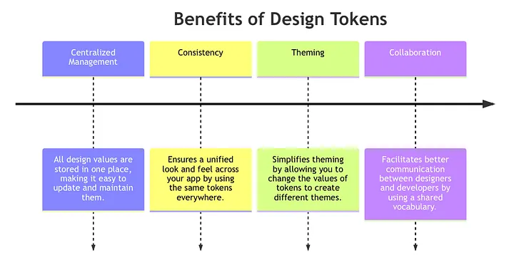
If your token system wins adoption and governance, here’s what you’ll begin to observe.
1. Faster design-to-dev handoffs
As both sides refer to the same source for web design, there will be fewer “what’s the correct margin?” or “which shade?” debates. You shorten review cycles and reduce wasted iterations.
2. Fewer inconsistencies in UI
Buttons, cards, typography across screens, everything uses the same data. The visual drift that often creeps in across features is greatly reduced.
3. Less firefighting and rework
Instead of fixing every misaligned pixel in QA or post-launch, you catch divergences early by enforcing token usage.
4. Easier theme changes or redesigns
Want to test a new brand color or refresh your UI? You can update token values and redeploy, rather than chasing individual style changes.
5. Stronger, more unified product experience
Your users will sense consistency even subconsciously. The visual language will feel coherent, trustworthy, and polished.
6. Better scalability as teams grow
Imagine dozens of designers and devs working on multiple modules. Tokens give structure, preventing each team from reinventing styles.
The big picture
To wrap up, design tokens are a powerful tool to keep designers, developers, and PMs aligned. They translate visual decisions into data, enforce consistency, improve handoffs, and scale with your product.
If your team is struggling with visual drift, inconsistent styling, or slow iterations, introducing tokens is one of the best investments you can make.
Stay pragmatic. Start small, document well, involve all roles, and evolve steadily. With time, you’ll see fewer mismatches, faster launches, and a more cohesive user experience.
And if you want the right environment to support that consistency, Nulab can help. Backlog keeps design and development tasks organized with clear version histories, while Cacoo makes it easy to document your design system, visualize token structures, and align teams visually. Ready to bring clarity to your entire workflow?
Author bio

Richa Gupta is a Content Marketing Specialist with over 7 years of experience. She has worked with various SaaS brands to create content strategies that boost organic traffic and generate qualified leads. She loves testing different strategies to increase engagement and build brand awareness. When she’s not coming up with new ideas, she enjoys reading novels or playing games on her PlayStation. You can find her on LinkedIn.
About Author


