Product design has a huge effect on your business. If your product doesn’t do what it’s supposed to, you have no business because people won’t use it.
The product design process is about making your site as fine-tuned to the user’s needs as possible. It’s an approach that puts the user at the center of everything. When it’s done well, designing a new product gives you an edge over the competition. Let’s take a closer look at the process, starting with a definition.
What is product design?
According to the Interaction Design Foundation, product design is a “process designers use to blend user needs with business goals to help brands make consistently successful products.”
It begins with product designers identifying a market opportunity. Next, they define the problem and a potential solution — all while keeping the user’s needs in mind.
Finally, once the product has been developed, it’s tested by real users and improved according to their feedback. This method stems from the concept of design thinking. Design thinking is a five-step process to refine the product, so the user has the best experience possible.
What is design thinking?
Design thinking is a human-centric creative process involving the product team putting themselves in the target users’ shoes and then asking, “how can I solve this problem?” This design methodology has five key stages in the product design cycle.
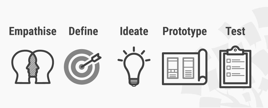
- Empathize
This is where it all begins. First, you put yourself in the user’s shoes by learning as much about them as possible. - Define
Next, take those user insights and use them to define a need from their perspective. - Ideate
Come up with as many solutions as possible. The freer and more creative you can be during this stage, the better. - Prototype
Test out your solution with prototypes. This pared-back version of the product is quicker and cheaper to create and will give you early insight into how well it answers user needs. The prototyping stage often sparks new ideas. - Test
Ask your users for feedback. Then, based on what they say, repeat stages 3 to 5 until your product is perfected.
Next step: the product design process
Once you’ve got your head around design thinking, it’s time to familiarize yourself with the seven product design steps. Keep in mind that every project is different, and these steps aren’t written in stone. However, having this structure in mind will help guide you to the finish line on time with minimum hassle.
1. Define your product vision
Before you even think about picking up a pen, you need to define your product vision. By this, we mean you need to know its reason for existing, and this needs to be clear as water. It also needs to be defined simply in a way that everyone understands.
There’s a famous Japanese proverb: “vision without action is a daydream. Action without vision is a nightmare.” We’ve all worked on a project where no one knows what’s going on, and the culprit is usually a lack of vision.
The vision needs to be a distilled explanation of why the product needs to be made. It should tell you exactly what your product is but also what it won’t be.
Here are three questions to help you work this out.
- What is the problem we need to solve?
- Who has this problem?
- What do we want to achieve?
Once you’ve worked out your product’s reason for existing, the team needs to define a strategy. That’s the route toward the product’s final destination — or in other words, the moment it’s in your user’s hands. Here’s a summary to help you remember the difference:
Vision: why are we doing this?
Strategy: how are we doing this?
2. Put some time into product research
Next stop: research. When it comes to this stage, the more you put in, the more you get out. So, don’t cut corners when putting time in the schedule.
Doing thorough research not only helps you create a product that’s better suited to user needs, but it also helps you get buy-in from stakeholders and investors. If you can demonstrate that there’s a gap in the market and your product can answer that call (i.e., product-market fit), you’ll find it much easier to get support.
User research
Understanding what your user wants is the key to designing a useful product. And to do this, you need to talk to them via interviews (video, face-to-face, or over the phone) or online surveys. Ideally, you’ll do both, but where time and budget are tight, online surveys reach a wider audience and cost less.
Top tip: to get the best answers, ask the right questions. Short, open-ended questions are best.
Market research
To stand out from the crowd, you need to know what the crowd is doing — and that starts with thorough research.
There are two types of competitors you need to keep in mind: direct competitors and indirect competitors.
- Direct competitors
These businesses directly compete against you, offering similar products and value propositions. Think McDonald’s vs. Burger King.
- Indirect competitors
These competitors don’t have the same value proposition as you, but some of their offerings would appeal to your customers. For example, ASOS sells clothes and skincare products, while Sephora exclusively sells skincare.
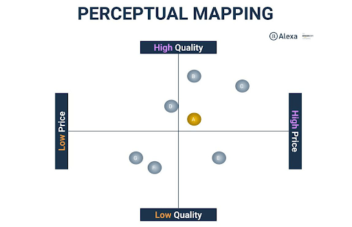
When doing market research for product design, it helps display your data visually. A perceptual map of competitors (pictured below) can help you see where your product fits in the market and who your nearest competitors are in terms of price and quality.
3. User analysis
Next, it’s time to make sense of the data you collected. The aim is to turn all those numbers and facts into an analysis that closely represents segments of your target audience. By clearly depicting a potential customer, UX designers can create products users want or need.
User personas
First, the UX designers will create user personas. User personas are fictional characters representing an archetypal customer of a specific group. This keeps user goals and needs in mind as you consider specific buying scenarios.
Let’s say, for example, the user persona is named Josh and has well-defined pain points and motivations. Designers can ask themselves, ‘Is this something Josh would do? Or would Josh enjoy that?’ It makes the process feel more realistic and personal.
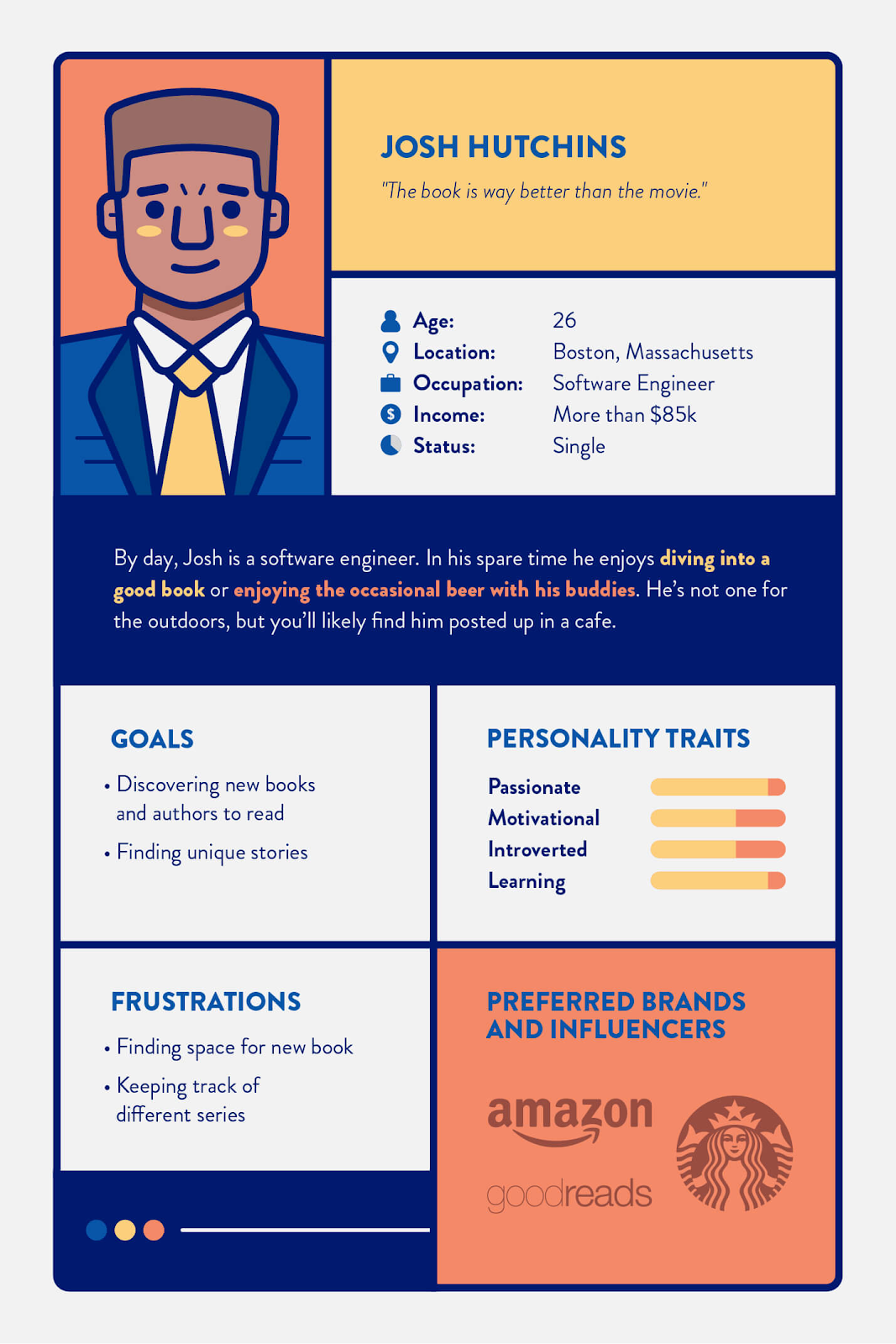
A typical example of a user persona includes their job, preferred brands, personality traits, and goals (Image Source )
You can start from a persona template or create yours from scratch.
Top tip: avoid using real names, including celebrities or fictional characters. This can color your view and distract you from the real data.
Empathy map
An empathy map will show you what the user thinks, hears, says, and feels. It gives greater insight into why a user needs or wants a certain product or feature. The empathy map’s purpose is to help the designers see the world through users’ eyes and create accordingly, rather than simply creating the thing they want to make.
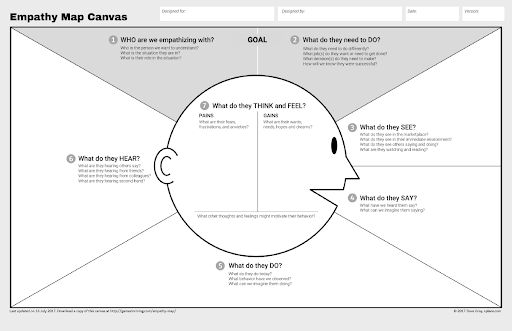
An example of an empathy map (Source)
4. Ideation time
The ideation phase is when the fun starts. All the designers working on the product gather together and concept as many creative solutions to the users’ needs as possible. You can conduct this brainstorming in person or online using a virtual whiteboard. There are many different techniques for generating ideas — from sketching wireframes to storyboarding interactions.
Make a user journey map
User journey maps (or customer journey maps) visualize the processes users go through to reach their goal.
They can be straightforward and linear or complex, with multiple options branching out from each decision. When looking at each stage, keep user wants, emotions, and needs in mind. Here are some questions to ask yourself:
- Objectives: what does the user want right now?
- Questions: what do users need to know to make a decision?
- Behaviors: how are users interacting with the site/app at this point?
- Emotions: how are users feeling?
- Weaknesses and strengths: how has the product helped the user or let them down?
- Influences: what will shape user decisions at each stage?
Sketch some storyboards
Make user personas the star of their own story with a storyboard. The result will resemble a comic book page with panels and scenarios involving the user interacting with the product. Storyboards help your team see the world through their user’s eyes and visualize their progression through the sales funnel.
Create user stories
User stories focus on needs and are written in a way that’s relatable for the user. Use a first-person perspective (i.e., I need, I want), and write a brief statement in simple language. Here’s an example: “As a solopreneur, I need an affordable, user-friendly tool to create and manage invoices so that I can keep track of business income.”
Traditionally, we write user stories on index cards. With limited space, you’re forced to give a snappy overview in one or two short sentences.
Generate structure ideas
The ideation stage also involves coming up with rough structure ideas. These may involve initial sketches of how the finished product might look or basic information architecture loosely describing how processes will work.
Wireframes
A wireframe is a pared-back visual representation of a website or app’s page layout. Wireframing is helpful for designers who need to communicate design features to non-technical folk (managers, stakeholders, and copywriters), helping everyone picture the interface.
Diagramming software allows you to create wireframes quickly. However, you can also sketch them by hand or use a combination of drawings and digital diagrams.
Sketching by hand is ideal for getting rough ideas onto paper, but when it comes to sharing designs with the wider team, a digital, cloud-based diagram is more versatile (especially if you have messy handwriting).
5. Time to design
The design team knows what they need to build, and now it’s time to get to work designing the product.
Rapid prototyping / creating a Minimum Viable Product (MVP)
A prototype, or MVP (essentially the same thing), is a bare-bones version of the product. It has just enough features for the user to interact with it, allowing designers to get early feedback before more time and money are invested into the project.
It also allows the team to learn more about user needs in quick iterations while the designers and developers can focus on just a few features at a time.
Design handoff
After prototyping, the design is ready for release to the developers for its final iteration. The designer will provide detailed design specifications describing exactly what needs to be done.
6. Testing and validation
The testing stage helps the team ensure the site or app works as it should. Testing should highlight areas you’ve missed or reveal interesting results if done correctly. So, don’t kick yourself if you find problems. Any issues you uncover will help you make the product better.
Eating your dog food
‘Dogfooding,’ as it’s informally known, is a stage where designers try out their own product. This helps them put themselves in the user’s shoes.
Usability testing
Usability testing is one way to make sure the website or app you create works as it should. It’s quick, relatively cheap, and straightforward. In user testing, you choose someone to use a version of your product, ask them to complete a task, and take notes. The goal is to learn what works and doesn’t and whether an average user can complete their intended action.
You can do this informally, using people from within the organization or bringing in outside testers to play around with the app or site. Or, you can formally conduct research with hired testers who have experience conducting usability tests but little or no experience with your specific product design.
7. Post-launch
The fun doesn’t stop once the product’s released into the wild. Monitoring, data collection, and improvement are ongoing processes that help ensure your site or app functions flawlessly.
Monitor the way people use the product. Analytics tools can provide data showing you where there’s room for improvement. For example, you can identify and get to the root of a problem if many users leave the site at a certain touchpoint.
You can also ask for user feedback or run A/B tests to determine how users interact with your app or site. By gathering feedback, you can spot problems and decide how to improve parts of the product to increase user engagement or conversions.
How to streamline the product design process
At a time when product designers are expected to deliver both speed and quality, teams must find ways to keep improving the product design process. One major perk of designing digital products is how easy it is to create a library of design materials you can repeatedly access.
Suppose you’re designing a new e-commerce website with advanced filtering features. Suppose you’ve created similar products in the past. In that case, you’ll most likely have a collection of sketches, wireframe templates, prototypes, and research studies that can help you form a product vision and brainstorm workable ideas early in the process. You’ll also have test programs and metrics your development team created to assess features on other products, so you won’t start from scratch when it’s time for the testing phase.
Develop a design system for your product team
If you want to get the most out of your team, use design systems to optimize the product development process. A design system consists of the methods, tools, and performance standards you develop and reuse to manage large-scale product design processes.
The advantages of a design system include the following:
- Convenience and scalability: consider a vast, content-heavy website like Facebook, which contains many pages and interactive features. A library of reusable components makes it easier to build and test new site features or replicate existing pages for expansion.
- Consistency: design systems provide a way to standardize your design methodology and output. Everyone is working from the same blueprint, so to speak, allowing you to deliver a consistent aesthetic and user experience across related products.
- Adaptability: team members come and go, but regardless, your team has to remain unified in the product design process. Armed with detailed information, new team members can quickly adapt to your organizational standards. Your resource library is also useful for communicating with stakeholders because you can use real product data and detailed visuals as the basis for your initial design goals.
Top tip: our diagramming tool Cacoo is an invaluable resource for jumpstarting your design system. With our convenient template library, you can create custom, reusable wireframes and other diagrams to simplify the design process.
Final thoughts
The design process isn’t linear, nor is there a single right way to do it. The most important thing is to remember to design for the user. Every feature should be useful to them. If you can do that, you’re well on the way to solving their problems and making products that set you apart from competitors.
This post was originally published on December 9, 2020, and updated most recently on February 25, 2022.
About Author
Georgina Guthrie
Guest authorGeorgina is a displaced Brit currently working in France as a freelance copywriter. Before moving to sunnier climates, she worked as a B2B agency writer in Bristol, England, which is also where she was born. In her spare time, she enjoys old films and cooking (badly).
