As every good UI/UX designer knows, empathy is the key to creating something users will love. You need to get inside users’ minds and understand what they want to achieve, as well as the steps they’ll take to get there. Having a good understanding of the user’s thought processes can help you make more effective user interfaces. And one particularly useful psychological quirk to know is the serial position effect.
What is the serial position effect?
Coined by German psychologist Hermann Ebbinghaus, the serial position effect is the tendency to remember the first and last items in a series more clearly than those in the middle.
When used correctly, this effect can actively reduce a user’s cognitive load while using your website or app. This makes it easier for your user to focus and recall information. So, in other words, it increases the likelihood of them staying on your site, carrying out the call to action, and remembering your message once they’ve left. Sounds like a pretty powerful tool, right?
How does the serial position effect work?
In a nutshell, the serial position effect is the combination of two main concepts: recency effect and primary effect.
- The recency effect refers to our tendency to recall items at the end of a sequence more than other items. The most recently processed information is easier for the working memory (the part of our brain that holds immediate, transitory information) to access.
- The primacy effect refers to our tendency to recall items at the beginning of a sequence more than other items. Retaining the earliest information requires relatively little cognitive effort. As we receive more information and must recall subsequent items alongside the preceding ones, each new item requires more cognitive effort. In other words, each new addition makes it harder to remember the sequence.
Note: the primacy effect lessens when we present information at a rapid pace. For example, when someone gives you their phone number, you’re much less likely to remember it if they rush through rather than say each number slowly.
The primacy effect and anchoring bias
Our habit of remembering the beginning of a list relates to another cognitive bias: the anchoring effect. An anchoring bias is the tendency to make judgments and evaluations based on the initial information we receive about a subject. As a result, we rely too heavily on the first information in forming an opinion and neglect subsequent details that could be just as helpful.
Anchoring bias occurs partly because people want to make choices faster, especially low-stakes decisions. Another factor is the credibility of the initial information. If we’re presented with an idea that seems sound and subsequent information supports it, our minds are primed to accept this information as a solid frame of reference.
From a design standpoint, leveraging the primacy effect and anchoring bias can increase conversions. The information or navigational elements you present first should always be useful and to the point. That way, visitors are more likely to follow the user path you’ve created, develop trust, and make proactive decisions to achieve their goals.
How distractions impact the serial position effect
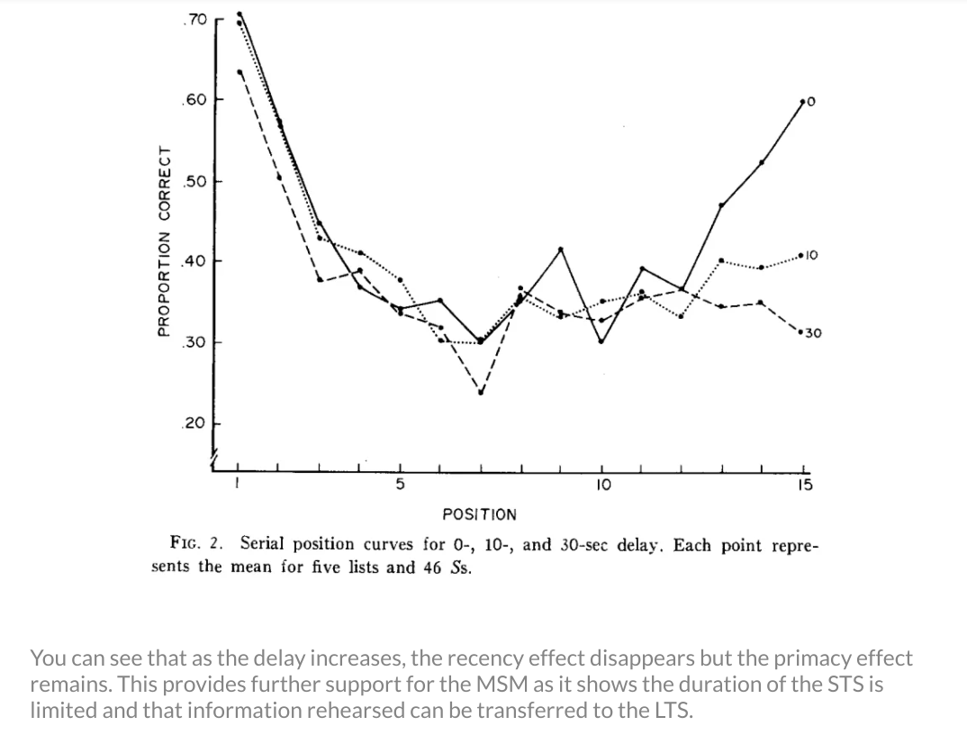
Cognitive scientists Murray Glanzer and Anita Cunitz (1966) conducted tests to investigate whether distractions have an impact on the primacy and recency effect. They discovered that after a 30-second distractor test, the primacy effect remained unchanged, whereas the recency effect disappeared.
In other words, our ability to retain recent information improves when we have adequate time to commit it to our working memory. Or, the longer we’re given to think about something, free from additional information, the better. They concluded that our maximum memory capacity is around three to four pieces of information at a time.

As you can see in the graph above, the effect disappears as the delay increases — but the primary effect remains.
To summarize:
- It’s hard to remember long lists of information.
- We’re less likely to remember the middle items in a list.
- We’re more likely to forget the last piece of information if we’re distracted.
- Events between initial exposure and later recall impact our ability to retain information.
How to use the serial position effect to make better designs
Here are three ways you can manipulate the serial position effect, limit distractions, and reduce cognitive load.
1. Display task-relevant information on the same page
Being able to see useful information at a glance reduces cognitive load because we don’t need to remember where these items are. Including tools and pop-ups on your homepage or dashboard can help guide your users towards the things they need.
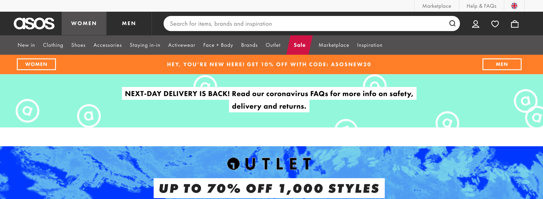
E-commerce sites help us stay on track by displaying relevant information along the top of the page. For example, the ASOS homepage (pictured below) has a little shopping basket icon that shows you how many items are in your bag, which is one less thing for you to think about or recall.
The site also has a ‘favorited’ section (the prominently displayed heart icon), which allows users to save items without committing to buying them. This enables users to work their way through the site without having to remember every single thing that catches their eye. It also makes them more likely to buy later. Had they been forced to remember every piece of clothing, they undoubtedly would have forgotten at least one or two.

2. Use color and other visual and reminders
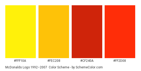
Colors can be a potent way to help someone remember information. In fact, it can increase brand recognition by up to 80%.
When designing a website, make sure you fill it with your brand’s shades in a consistent way. It’ll help your users find specific information and remember you once they’ve left the site. Don’t believe me? Glance at the color swatches below and tell me you’re not craving fries. 😉

Color cues can also lead your user through your website. Again, referring back to that ASOS homepage, you’ll notice the sale tab is highlighted red — a color commonly associated with sales or clearances in the US, UK, and Europe. You don’t need to remember there’s a sale because there’s a visual reminder that grabs your attention.
3. Work with the serial position effect (and not against it)
Unsurprisingly, you can’t completely avoid the fact that users will forget information. So, instead of cursing your user’s poor memory, work with it.
People forget things in the middle, so take note and put important things at the beginning and the end. If you’re designing an e-commerce site, you might want to make the first and last pieces of information the most prominent. Usually, that’s the initial introduction (why you should buy it) and the call to action (how to buy it), with all the technical information in the middle.
The same applies if you’re creating a blog, writing an article, or creating some brand guidelines. Put the key content at the top, and reiterate it at the bottom alongside a call to action.
4. Avoid using intrusive design elements
Since you have limited time to connect with users who land on your site, don’t waste that opportunity bombarding them with disruptive elements.
When used minimally, moving or pop-up elements can appeal to the recency effect and keep content fresh on a user’s mind. However, they can also be intrusive and interrupt information your user is already processing.
Common examples include large sidebar menus, headers, and footers that expand automatically and obstruct a user’s view of the screen. Multiple pop-up messages and forms are also intrusive, especially when they load when the user is in the middle of their intended action. If site visitors have to repeatedly stop what they’re doing to clear all these unnecessary elements from the screen, they’ll get frustrated and leave.
Final thoughts
Every element of your design should work towards making recall easier for your user. So, keep it simple. Understanding their limits is an essential part of achieving this.
Rather than resenting our short attention spans, focus on working with them. Minimize cognitive load by drawing attention to vital information and providing lots of visual reminders and cues.
When a design is good, it’s seamless. The user can use the app or website without being aware of the effort it takes to remember information. Achieving this state is often a process of trial and error, but the tips above will give you a leg up in getting there.
Combine these with plenty of research on best practices and a well-designed wireframe. Before you know it, you’ll be well on your way to creating an app or website users remember for all the right reasons.
This post was originally published on June 5, 2020, and updated most recently on January 28, 2022.
About Author
Georgina Guthrie
Guest authorGeorgina is a displaced Brit currently working in France as a freelance copywriter. Before moving to sunnier climates, she worked as a B2B agency writer in Bristol, England, which is also where she was born. In her spare time, she enjoys old films and cooking (badly).


